Description:
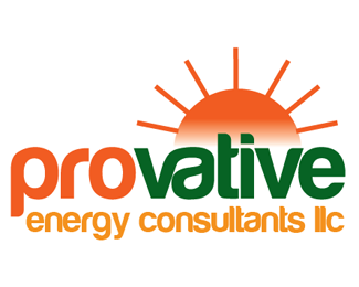
After a long series of exchanges between myself and the client and over a dozen different designs, this is the one that we've cobbled together that the client likes. I dislike it because I think that it isn't representative of the company, which is an energy cost-saving and consulting company. It looks more like an agricultural TV show to me. Anyway the client wants a cliche symbol such as a lightning bolt introduced into this logo. I'm wondering if anyone with a fresh perspective has an idea on how I might affiliate this logo more with the energy industry without destroying its basic underlying premise. Thanks for any thoughts!
Status:
Work in progress
Viewed:
2334
Share:


Lets Discuss
i really don't know how designers can use this crapy font! it's a very good idea but its very poorly crafted..
Replyunless it's solar energy...this is pretty much off target
ReplyAppreciate the feedback guys.
ReplyPlease login/signup to make a comment, registration is easy