T-Rex Theater
by ejefferi • Uploaded: Aug. 17 '12

Float
(Floaters:
1 )
Description:
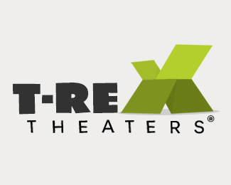
Edit on initial concept for T-Rex Theaters (large format theater brand like IMAX). X used as very primitive shape of dinosaur, looming over other letters to show size of T-Rex Theaters (screen size, overall scale). Used the letter 'E' to also give a sense of size. Playful feel to try and be an approachable brand with such an intimidating name for kids.
Status:
Work in progress
Viewed:
2521
Tags:
comical
•
bold
•
playful
•
vermont
Share:


Lets Discuss
Please look at my previous comments, some may apply.
ReplyI disagree with designfacet in some ways. What you have here is definitely playful. Almost whimsical and comical in fact. Nothing says you have to dot the i's and cross the t's all the time. I got the T-Rex aspect in the X as soon as I saw it and when I showed my 3yo daughter, she said it was a monster (claws up and lets out a mighty roar!). We tend to spell every thing out to kids these days. Let them or your target audience use abit of imagination. It is theater afterall!
ReplyTighten up T-R. Make the E lean back a fraction more to exaggerate the scariness of the X. Give just a tiny bit more space between T-Rex and Theaters.
Enhance the shadows a tad more on the X. They are ever so faint! And zoom out a bit overall so it\'s not crowding what borders and real estate you have.
ReplyPlease login/signup to make a comment, registration is easy