by dreamstation • Uploaded: Feb. 11 '09
Add to Pad (In 3 Pad s )
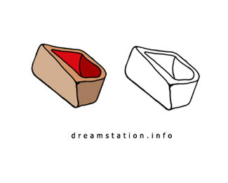
Description: Bellway Status: Nothing set Viewed: 1335 Share:
i like the illustration, but i find the two L's too close to each other
Yeah, and developments looks too squished, but this is a seriously nice logo. I love mono. Those buildings rock my socks.
I agree, the buildings rock. typography could use a little work.....
Please login/signup to make a comment, registration is easy
Follow


Lets Discuss
i like the illustration, but i find the two L's too close to each other
ReplyYeah, and developments looks too squished, but this is a seriously nice logo. I love mono. Those buildings rock my socks.
ReplyI agree, the buildings rock. typography could use a little work.....
ReplyPlease login/signup to make a comment, registration is easy