Float
(Floaters:
0 )
Description:
i was hoping it speaks for itself
Status:
Nothing set
Viewed:
825
Share:


Lets Discuss
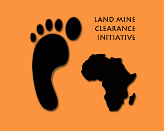
you know, if you were to turn the foot to the left it would resemble the shape of africa. that way you might could place it on top and get some interesting negative space out of it...idk. just a suggestion...
ReplyNo offense, but this really isn't much of a logo. There's nothing grounding it or tying it together - it just feels like 3 random elements on an orange background.
ReplyNone taken, just looking for some input. The point is it draws attention and that's what it is all about.
ReplyIt somewhat draws attention because of the black on orange, not necessarily because of the design or subject matter. You should consider redesigning it to be more of a cohesive unit - it would have greater impact that way.
Replysatansgoalie gave you a good suggestion, if Africa was more foot shape and then add fingers on top it could look interesting (but I think i saw a logo like that and thats why i have this idea)
Replyyea that was obvious *http://www.limpopoled.com/images/Open-Africa-logo.jpg*http://www.mineseeker.com/images/sole%2520on%2520curve2.jpg*and probably a lot more..*
Reply(sorry erase this please)*
ReplyOK, I appreciate the suggestions, but how does making something look more like something you've seen elsewhere help?*Anywayz, the point was to stress the fact that after stepping on land mine people are left with only one foot (left one in this case), so...
ReplySo nothing...the concept is way too vague. I didn't get that Africa was supposed to represent a right foot at all until you pointed out that fact. And I'd image that people lose more than just one foot in many cases when they step on a land mine.**As I said before, it looks like 3 separate random shapes on a page and there's nothing really tying them together except for color, which isn't enough in this case. Sorry but your execution is falling short of your idea.
Replyi would have to agree with sdijock, i think from a emotional standpoint the concept is not pulling the audience in, it is not conveying the significance that landmines have in Africa. sdijock has already stated a lot of what i think as well.
Replyhi, below is link to my way to do this idea. *Best Rgds.*http://logopond.com/gallery/detail/44096
ReplyPlease login/signup to make a comment, registration is easy