Description:
Marketing Company.
As seen on:
Down With Design
Status:
Client work
Viewed:
12834
Share:


Lets Discuss
so simple, love this - great job gareth
ReplyGood eye greyman, back to illy I go... %3B)
Replyi think this is just fabulous. the imagery you pulled together for this logo is really intelligent. i peeked at your others and I love the design style you have.
Replyyeah what tony said
ReplyI think that should improve it, agreed?
ReplyWere you not talking about the weight of the strokes? Or am I being a dingo here?
ReplyPut this dingo out his misery then...
ReplyQuick hide the baby,itsgareth thinks his a dingo:P)...Nice simple and on point!
ReplyCheers Fabian haha!%0D*%0D*Toni, updated it as per your suggestion but don't know if it has the same impact...
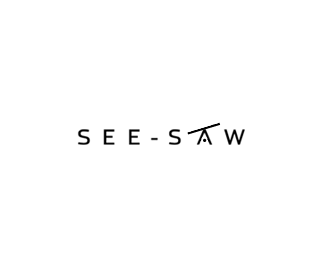
Replyi love the simplicity of this...but i definitely liked the balance of the other version better (the A just looks too wonky to me now).
ReplyAbsolutely fine as it is, Gareth, but how did it work with a normal A (with a bar)?
ReplyCheers Roy, it looked good but I though the circle looked better as it micked the rolling effect of the see-saw
ReplyI see.
ReplySTOP. This is perfect. I like the normal sized A and the dot. Great work.
ReplyI like as is too
ReplyThankyou
ReplyUpdated as per final version.
ReplyHaha, Gareth, me likes!
ReplyResult. No need to ram it home with the handles tho %3B)
ReplyThis is simple, ingenious, fantastic. Perfect execution of a brilliant concept.
Replyvery nice %3B) and very simple i like it
ReplyPlease login/signup to make a comment, registration is easy