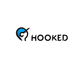
Description:
An organisation that helps kids to replace damaging addictions with sport activity.
As seen on:
Down With Design
Status:
Unused proposal
Viewed:
5574
Share:


Lets Discuss
Clever how the rim of the baseball cap forms the hook. Do I see a heroin spoon?
Replyi like it but the baseball cap wasnt clear to me at the beginning.. it looks kind of %22painful%22
Replyi agree with penflare--just needs a little tweaking (maybe it's the angle of the cap/head?)
ReplyThanks for the comments. I think maybe some shading may make it look more apparent. Cheers
ReplyI think the hook is more subtle now with the cap being more prominent than before...
ReplyThanks Houston, I like your new icon %3B)
Replythat is awesome gareth, the updated version is perfect
ReplyCheers for the heads up Sean, tip of the hat, sir.
ReplyRoy, good eye mate.
ReplyIt's certainly a nice idea, but mixing the hook and the head leads to a lot of negative connotations. For one, there was a scene in a %22Hellraiser movie%22:http://www.shadow-writer.co.uk/images/hellraiser.jpg that this mark is very much reminds me off. **
ReplyI completely disagree epsilon.
ReplyVery clever mark, Gareth. The type-work is inspired also. Happy Chrimbo btw :)
ReplyGareth, don't get my comment the wrong way. It _is_ a very clever mark. I'm just saying that there are people, like myself, who will see in it something what you as its creator don't. It's purely a feedback to keep in mind, no need to agree with it :-)
ReplyCheers Sean, same to you mate have a good one!%0D*%0D*Epsilon, sorry if I came across as being uppity, I wasn't, I'm accustomed to negative feedback and thrive upon it. Every design has flaws, it's just I disagree with your previous comment as in this instance I thought it was a bit of an outlandish similarity.%0D*%0D*Most people (especially non-designers) are unlikely to even see the hook in the mark so I don't think it causes offence or is going to be perceived as gruesome. Even so drug addiction is not a pretty subject, but having said all this the client is king so we shall see. Thanks again.
ReplyNo worries. Mark alone is of course fine and I agree that the hook is barely noticeable. But when it says %22hooked%22 right next to the mark, it requires very little effort to realize what the mark is about.
ReplyHe's only being given a clip round the ear though not a full on stab in the eye ball.
ReplyNice!
Replygreat idea... great illustration... great font
ReplyGreat mark! I don't see any problems with the hook in the illustration, it didn't come across as anything negative to me. But hey, everyone sees things a little differently. :)
ReplyThanks nima, yourlike an archive fiend!
ReplyI think the logo image matches the type perfectly!!! GREAT JOB!!!
ReplyPlease login/signup to make a comment, registration is easy