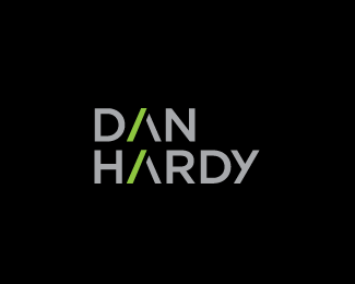
Description:
Logo for my brother who is a web developer.
As seen on:
www.danielrhyshardy.com
Status:
Client work
Viewed:
7059
Share:
Lets Discuss
solid, original, and right on point. how would it worked with lowercase while keeping the AA ?
ReplyThanks T-Sovo. I see what you mean. That way it kind of made the A\'s look more like a ^ (anyone know the name for that symbol by the way?) so we decided to keep it all in uppercase so that they didn\'t stand out so much. I think the more subtle reference to the // used in http:// works better.
ReplyNice one. Digging that \"y\".
ReplyThanks Rokac
Replysmart solution
ReplyLove it. I wonder what it would look like if you made the type vertical so the carats were facing each other. Don't know if it would affect readability, but it could be more powerful. Well done.
ReplySimple and effective Gareth.
ReplyRefreshing to see a simple logo in the gallery. Always liked this one Gareth.
ReplySmart, simple and just right.
ReplyThanks for the kind words, Dan is chuffed to bits :)
Replyyea loving this!
Replyvery good Work!
ReplyPlease login/signup to make a comment, registration is easy