%5E hey dude, reason is if one of my designs doesn't get used then I won't show the typography as I think it's unfair to reveal the identity of the company if the logo doesn't represent them. Just out of respect I suppose, so that it doesn't interfere with what they have chosen. If the final turns out to be a Frankenstein mish-mash of concepts or is based on a clients doodle on a napkin that they got inspired by whilst reminiscing of high school art classes then I probably won't upload it either. :)
mainly because all these inspiration sites go round pinching logos from here so once that has happened and it's got your clients name on it can be a nightmare trying to retract it all
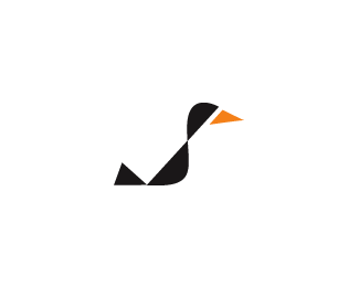
hey man, i think the problem is that while the bird's right wing has the feathers pointing down, the left one has them pointing up. also, maybe the left one just a bit smaller?**nonetheless great execution!
gareth, this is really awesome. some people here observed a difference between the wings and perspective. I think that white-negative spaces are the problem:p maybe make those smaller or bigger or equal. Or maybe make the right wing smaller and closer or far from the body and head. or maybe leave it as it is if the client loves it like this, gosh. Nice concept and idea:)
I like where this is going Gareth. Maybe instead of the white space below the head, you can make it a darker purple to continue from the head. The back wing seems a little off to me because it is pretty much straight and the closer wing has a nice curve to it. Try curving the back wing a little. Just my two cents.


Lets Discuss
Lovely style mate.
Reply%5EYes, indeed! Btw, you%60re rarely uploading completed designs? Would love to see some of the recently uploaded marks with some typography, man.
Reply%5E hey dude, reason is if one of my designs doesn't get used then I won't show the typography as I think it's unfair to reveal the identity of the company if the logo doesn't represent them. Just out of respect I suppose, so that it doesn't interfere with what they have chosen. If the final turns out to be a Frankenstein mish-mash of concepts or is based on a clients doodle on a napkin that they got inspired by whilst reminiscing of high school art classes then I probably won't upload it either. :)
Replygotcha. :)
Replymainly because all these inspiration sites go round pinching logos from here so once that has happened and it's got your clients name on it can be a nightmare trying to retract it all
Reply%5E I can understand that.
Replyposterior wing has not a correct perspective.
ReplyHey Gareth, I'm having the problem with the right wing, looks a bit strange according to the left one.
Replyyep think it's possibly too high
Replythink this fixes it :)
Replyhey man, i think the problem is that while the bird's right wing has the feathers pointing down, the left one has them pointing up. also, maybe the left one just a bit smaller?**nonetheless great execution!
Replygareth, this is really awesome. some people here observed a difference between the wings and perspective. I think that white-negative spaces are the problem:p maybe make those smaller or bigger or equal. Or maybe make the right wing smaller and closer or far from the body and head. or maybe leave it as it is if the client loves it like this, gosh. Nice concept and idea:)
ReplyI like where this is going Gareth. Maybe instead of the white space below the head, you can make it a darker purple to continue from the head. The back wing seems a little off to me because it is pretty much straight and the closer wing has a nice curve to it. Try curving the back wing a little. Just my two cents.
ReplyPlease login/signup to make a comment, registration is easy