by diogoseibert • Uploaded: Sep. 13 '11
Add to Pad (In 0 Pad s )
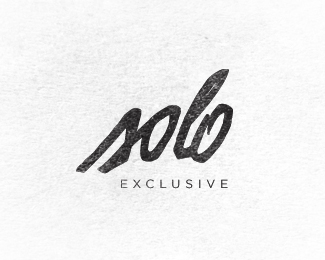
Description: Third try Status: Work in progress Viewed: 2283 Share:
Great, man! Looks really cool!
Yeah, I agree. Much more clear (and good looking) than the other two.
cool type, man. I like the texture in the background, I'd just keep the whole thing the same value as it is in the bottom left corner (no grey splotch in the middle!). nice work!!
yup very nice.
Thanks Colin.*Cool designtofeel, i think so too.*
Please login/signup to make a comment, registration is easy
Follow


Lets Discuss
Great, man! Looks really cool!
ReplyYeah, I agree. Much more clear (and good looking) than the other two.
Replycool type, man. I like the texture in the background, I'd just keep the whole thing the same value as it is in the bottom left corner (no grey splotch in the middle!). nice work!!
Replyyup very nice.
ReplyThanks Colin.*Cool designtofeel, i think so too.*
ReplyPlease login/signup to make a comment, registration is easy