Rastaman 2
by designer • Uploaded: Dec. 10 '10 - Gallerized: Dec. '10
Description:
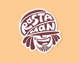
I've decided to change the character's hat and made it more 'rastamanian' hat than in my previous variant that logo... I think logo become better. I think it final view of logo )
P/s Thanx people for yours previous commnts!)
Status:
Work in progress
Viewed:
24,240
Tags:
smoke
•
rastafan
•
rastaman
•
rasta
Share:

Lets Discuss
ha ha! IT IS BETTER!
Replyright, much better.... great skills !
Replyvery nice
ReplyMy congratulations)
ReplyCool fella!
ReplyGreat! :-)
ReplyLove the character, relaxed and sweet style!
ReplyThanx cresk ) %0D*
ReplyVery nice work man*just posted on my blog http://www.csshunt.com/logos/
Replyexcellent
ReplyMuy bueno!
Replygood job
ReplyPlease login/signup to make a comment, registration is easy