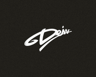
by deiv • Uploaded: Mar. 25 '12 - Gallerized: May. '12
Add to Pad (In 14 Pad s )
Description: PANDORA™ Status: Client work Viewed: 5740 Share:
Nice bit of type work, Deividas! Has grat balance.
Thank you, Mikey!
good one friend
instant float
haha! thank you :)
Great stuff, Deiv, really like it!
thank you, Sean! working on letter R to make more readable thing... http://dribbble.com/shots/486965-R?list%3Dfollowing
very good type!
the third R looks most like an R, the second coming after that, the first reads as a K to me.
The bad thing is the visual difference between P and R is very minor.
Hey guys, thank you for the comments. I am still working with it and yes i know the P and R problem, but i've made some changes and will upload it next day. thank you. you're the best
Approved. Thank you for your comments once more.
congrats buddy !
Glad that it's approved. Really good wordmark :-)
Turned out GREAT!
Faved!
I love the color and texture! Great work!
lurvley!
Sweet type work, man. Has a great flow to it!
Cool typography!! 5 stars...
OSOM!
awesome, indeed!
Please login/signup to make a comment, registration is easy
Follow


Lets Discuss
Nice bit of type work, Deividas! Has grat balance.
ReplyThank you, Mikey!
Replygood one friend
Replyinstant float
Replyhaha! thank you :)
ReplyGreat stuff, Deiv, really like it!
Replythank you, Sean! working on letter R to make more readable thing... http://dribbble.com/shots/486965-R?list%3Dfollowing
Replyvery good type!
Replythe third R looks most like an R, the second coming after that, the first reads as a K to me.
ReplyThe bad thing is the visual difference between P and R is very minor.
ReplyHey guys, thank you for the comments. I am still working with it and yes i know the P and R problem, but i've made some changes and will upload it next day. thank you. you're the best
ReplyApproved. Thank you for your comments once more.
Replycongrats buddy !
ReplyGlad that it's approved. Really good wordmark :-)
ReplyTurned out GREAT!
ReplyFaved!
ReplyI love the color and texture! Great work!
Replylurvley!
ReplySweet type work, man. Has a great flow to it!
ReplyCool typography!! 5 stars...
ReplyOSOM!
Replyawesome, indeed!
ReplyPlease login/signup to make a comment, registration is easy