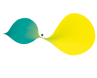
Float
(Floaters:
10 )
Description:
Work for an interpreter
Status:
Unused proposal
Viewed:
2047
Share:
Lets Discuss
this is excellent... very unique and fresh...
Replyit is a shame it went unused... the branding on this would have been great to work with...
Reply%5E Are the two of you for real?%0D*%0D*This logo-image looks very... unprecised, but this is exactly why it fits the client who is an interpreter. It can be read in hundreds of ways. I for one... have yet to decide for myself what am I seeing here :) but it made me think over the concept for a longer time (as in, still thinking), which I consider a success.
Replybtw... @dasursi... this is the sort of thing I had in mind with a small aspect of the branding material...**http://www.logodesignlove.com/unsung-heroes**take a look at frut.
Replyscale it down within the presentation area and I think you may see people warm to this more. It's certainly interesting %26 different.
Replyand FWIW I viewed the * as being the basis for connection, two people speaking different languages yet the communication is still there. As far as I know the asterix is the same in every language, so Kudos for that. V. good thought process here, which often gets overlooked if there is no immediate clever logo wordplay, bs customised type or the latest use textures and other common trends. If this was posted on dribbble you would probably find that this would have gotten rave reviews.
ReplyAfter seeing your link Nido. I can totally see the potential for this.
ReplyIt's definitely different but I too can see the implied meaning here with the shapes and asterisk. And after seeing the Frut branding I totally see this working. Unless I missed it I don't think the designer has said if this is for fun or for real (although it's marked as an unused proposal). If it's for real my bet would be this design would be a hard sell and it would have to be just right person or entity who would appreciate it.
ReplyOn this as a logo%3B It's already been mentioned down the thread, but yes the right execution for the right person...on those terms everything has a branding potential, finding the 'right' execution for that person through intuition just comes with experience.**It is very easy to look at something %26 simply say %22it doesn't work%22 or %22it's crap%22...each to their own of course but I think it shows great character to attempt something completely out of left field.
Reply%5Ehave to very much agree with Hayes Image on the left filed attempt, I'd admire that, but personally I don't like it this particular execution, but thats just my opinion. On another note some of the things said here from both sides have been disgraceful, and I am completely shocked that no attempts from admin have been made to remove some of the comments. I have seen people been pulled up for far less offenses.
ReplyAgreed, looked on the links, and this might have a big potential if executed correctly.
ReplyGlad that a lot of you are beginning to see what I initially saw in this logo... if you get passed the %22what is considered 'good' on logopond%22 thing...**Here's that link again to frut's branding...**http://www.logodesignlove.com/unsung-heroes**Cant find a more substantial study of it but will give you an idea where this can go too...
ReplyThe thing is that you can pretty much make a nice cohesive branding system for about any logo out there, regardless of the logo aesthetics, so when i see any logo in logopond, i try and judge it on its own merit, the frut's logo looks good on its own, this one how ever does not, to me it looks like a mesh experiment.
Reply@ nido: thanks for the link :)
ReplyI drumroll ... agree with Nido on this .. even when scanning the pages it does jump out at ya and branding potential is evident and synonomous. Always scares me when you judge a logo on its on merits as an exquisite jewel on an ugly ring always leaves a bad impression
Replythis logo takes things up a notch - good too see intelligent design
ReplyI'd like to add that based on part of Mike's comment above %22branding potential is evident%22...the fact that this design has stirred so much emotion (and eruption) conclusivley proves that very potential.**Further more. If just as many people view it with distain as there are people who view it adoration (no indifference) then it owns 100 percent of the audience.
ReplyI think the H-I in Hayes avatar stands for higher intelligence
ReplyIt would be great if you can add a chat facility :)
Reply%5E Yeah,, i don't think that is a good idea. One of the great things about this site is that everyone can read everything, at that whats makes this place so great for learning new stuff from very wise people.... like hayes...%3B)
Reply%22It would be great if you can add a chat facility :)%22...**An actual %22voice%22 facility would be even better...
ReplyPlease login/signup to make a comment, registration is easy