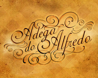
Description:
Portuguese and brazillian food restaurant. I used a simple font found at dafont.com as a base type to build this one.
Status:
Nothing set
Viewed:
7050
Share:



Lets Discuss
Amazing calligraphy!
ReplyYeah, Great work it's beautiful.
ReplyBeautiful indeed.
ReplyAmigo,%0D*%0D*Sou ga%FAcho e gostei do seu trabalho. Gostaria de saber se voc%EA tem outros trabalhos e quanto em m%E9dia cobra pela cria%E7%E3o de uma identidade corporativa. Agrade%E7o se entrar em contato pelo email rafabastos@ig.com.br.%0D*%0D*No aguardo de sua comunica%E7%E3o,%0D*%0D*Rafael B. Queiroz
ReplyVery elegant... did you hand letter this?
Replygorgeous use of ornaments and swashes.
Reply%5Ewhat everyone else said. I assume rafagramado said nice things, if not, then exclude him. :)
ReplyThe world needs more of this. Just awesome!
ReplyIt amazes me that something so beautiful and hard to do does not receive more recognition. Let me ask you all something can you do this? and don't you think it's beautiful? IMO this deserves more kudos.
ReplyThanks a lot for the comments, guys!!
Reply%5E%5E Beautiful
ReplyThis is awesome. And I definitely couldn't do this. Wow.
Replynice arrangement of the font, and great presentation
ReplyThe cool thing is my eye doesn't want to get stuck anywhere in this design. That's hard to do. Very well balanced.
ReplyThis type of typography is so HARD to do, but you pulled it off beautifully. real nice design and execution.
Replythis seems like it would be a lovely place to take my wife for a romantic meal... %26 then make her pay...
ReplyNice work indeed.
ReplyThere was a time when this kind of work was executed flawlessly on parchment, engraved on metal, stone or wood by hand. Whatever %22machine%22 you used isn't obvious - this shows high artistic sense and skill. Great work!
Replyperfect design, also the color scheme is very attractive..
Reply%22aldente%22
ReplyPlease login/signup to make a comment, registration is easy