Description:
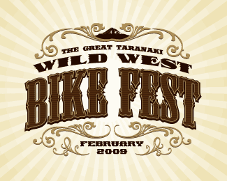
Used for bikewise month posters, flyer, T's. Client loved it and the T-shirts have become collector's items (we only did 30). Designer: Luke Thompson, Creative Director: Chris Young.
Status:
Client work
Viewed:
2881
Share:


Lets Discuss
i really like it cseven The type chosen seems pretty hard to read at smaller sizes. Also, what is at the very top of the embellishments, is that a mountain? whatever it may be, I think it could use some adjustments to make it more obvious.%0D*%0D*but i just read your description, so it seems it's finalized, so nevermind :P
ReplyThanks for your comments George.*Because it was for an event, this was never made to be smaller than 10cm across, so the detail didn't get lost.*Yes that's a mountain - Mt Tarankai, which broods over our region and looks amazingly like Mt Fuji. It was clear on the printed material.
Replybeauty
ReplyGREAT Job, especially for a poster.
ReplyThanks Guys.
ReplyThis is great man.
ReplyYep...dig it.
ReplyOne more float 4U.
ReplyChad, Glen, Rudy - thanks Gents!
ReplyI'm liking this a lot.
ReplyThanks Alex. I'll upload this year's version when I get a chance...
ReplyPlease login/signup to make a comment, registration is easy