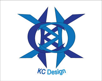
croxford24kyle,*this is a major step forward in the right direction. Is it perfect? NO, but it is a lot closer than the last version of this logo. It still breaks some of the fundamental rules of logo design. If I again could give you one piece of advice to help fix this logo, it would be simplify it. There is STILL WAY TOO MUCH GOING ON WITH THIS LOGO!
in all honesty, I'd try drawing out some ideas for logos first. It doesn't matter if you think you can draw or not, it forces your mind to think differently and visually. I would suggest that to everybody doing this logo design course thing that seems to be happening. **1. do research on the topic (what images are used to depict the client's business**2. do MORE research! you need to figure out what kind of images out of all that you've seen resonate the most with the audience.**3. write up a word list of anything and everything that has to do with the product/client.**4. study that list and see if there are any interesting connections between words that you could use to create a unique image (this is great for coming up with company/product names too).**5 THEN you can start sketching. Don't touch a computer! just sketch! doesn't matter if it looks bad! I do between 50-100 thumbnail sketches for a project. Sounds like a lot, but once you get going they add up pretty quick. Usually the winning concept happens somewhere around sketch 30 or 40, but you never actually know what is the best one until you've pushed your mind as far as it can go. Take breaks in there too.**6. refine the sketch. Figure out the kinks. don't just write words where you want them to go. Figure out what kind of font you want to use and draw it! you're allowed to trace.**7. plan how you're going to produce the mark digitally. This is very important. don't just jump right in. You should have a pretty good idea of what the final image will look like. Figure out step by step how you're going to get there before you start.**8. do it.


Lets Discuss
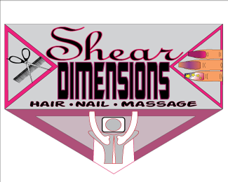
hmm, it's a bit hard to read. maybe if the words were in white it would be easier?
Replycroxford24kyle,*this is a major step forward in the right direction. Is it perfect? NO, but it is a lot closer than the last version of this logo. It still breaks some of the fundamental rules of logo design. If I again could give you one piece of advice to help fix this logo, it would be simplify it. There is STILL WAY TOO MUCH GOING ON WITH THIS LOGO!
Replyin all honesty, I'd try drawing out some ideas for logos first. It doesn't matter if you think you can draw or not, it forces your mind to think differently and visually. I would suggest that to everybody doing this logo design course thing that seems to be happening. **1. do research on the topic (what images are used to depict the client's business**2. do MORE research! you need to figure out what kind of images out of all that you've seen resonate the most with the audience.**3. write up a word list of anything and everything that has to do with the product/client.**4. study that list and see if there are any interesting connections between words that you could use to create a unique image (this is great for coming up with company/product names too).**5 THEN you can start sketching. Don't touch a computer! just sketch! doesn't matter if it looks bad! I do between 50-100 thumbnail sketches for a project. Sounds like a lot, but once you get going they add up pretty quick. Usually the winning concept happens somewhere around sketch 30 or 40, but you never actually know what is the best one until you've pushed your mind as far as it can go. Take breaks in there too.**6. refine the sketch. Figure out the kinks. don't just write words where you want them to go. Figure out what kind of font you want to use and draw it! you're allowed to trace.**7. plan how you're going to produce the mark digitally. This is very important. don't just jump right in. You should have a pretty good idea of what the final image will look like. Figure out step by step how you're going to get there before you start.**8. do it.
ReplyPlease login/signup to make a comment, registration is easy