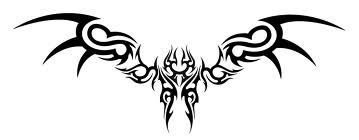
To be honest, this logo is a mess! You need to look at the rules of logo design and rework this logo. First of all there is way too much detail. Logos need to be simple.**Rules:**2.%09Get rid of everything that is not absolutely necessary.**7.%09Confirm that the logo looks appealing to more than just three (3) individuals.**10.%09The logo should look good in black and white.**11.%09Make sure that the logo is recognizable when inverted.**12.%09Make sure that the logo is recognizable when resized.**15.%09Do not use special effects (including, but not limited to: gradients, drop shadows, reflections, and light bursts).**16.%09Fit the logo into a square layout if possible, avoid obscure layouts.**17.%09Avoid intricate details.**25.%09Do not use more than two fonts.**25.%09Do not use more than two fonts.**32.%09Even large companies need small logos.**36.%09The logo must be easy to describe.**39.%09Keep the design simple.**41.%09The logo should not be distracting.**44.%09Avoid bright, neon colors and dark, dull colors.**These are just a few. If I could give you just one thing to fix it would be that this logo has TOO much going on. It needs to be simplified.
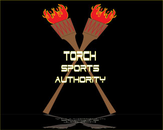
There is definitely a loooot going on in this one, it looks maybe more like a sign that would be outside of the business than a logo for the business.**It almost looks like the guy getting the massage is getting torn in half. 'Tis the massage of doooom.
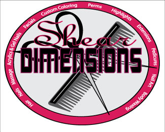
WAY TO BUSY. This would never work as a logo. The text for Shear is the only element I feel is salvageable. Your illustrations are confusing, I had to look them over a few times before I got what was happening. The whole purpose of graphic design is to get your message to people with out them having to think about it. If you take in to consideration all the rules Vision gave you, your logo would be a blank page. Get with Sam and get my contact information and we can go over it if you would like.


Lets Discuss
To be honest, this logo is a mess! You need to look at the rules of logo design and rework this logo. First of all there is way too much detail. Logos need to be simple.**Rules:**2.%09Get rid of everything that is not absolutely necessary.**7.%09Confirm that the logo looks appealing to more than just three (3) individuals.**10.%09The logo should look good in black and white.**11.%09Make sure that the logo is recognizable when inverted.**12.%09Make sure that the logo is recognizable when resized.**15.%09Do not use special effects (including, but not limited to: gradients, drop shadows, reflections, and light bursts).**16.%09Fit the logo into a square layout if possible, avoid obscure layouts.**17.%09Avoid intricate details.**25.%09Do not use more than two fonts.**25.%09Do not use more than two fonts.**32.%09Even large companies need small logos.**36.%09The logo must be easy to describe.**39.%09Keep the design simple.**41.%09The logo should not be distracting.**44.%09Avoid bright, neon colors and dark, dull colors.**These are just a few. If I could give you just one thing to fix it would be that this logo has TOO much going on. It needs to be simplified.
ReplyMy first thought was teh same. Very busy. I like a lot of aspects of it, the fingers look good etc. The scissors as well.
ReplyThere is definitely a loooot going on in this one, it looks maybe more like a sign that would be outside of the business than a logo for the business.**It almost looks like the guy getting the massage is getting torn in half. 'Tis the massage of doooom.
ReplyWAY TO BUSY. This would never work as a logo. The text for Shear is the only element I feel is salvageable. Your illustrations are confusing, I had to look them over a few times before I got what was happening. The whole purpose of graphic design is to get your message to people with out them having to think about it. If you take in to consideration all the rules Vision gave you, your logo would be a blank page. Get with Sam and get my contact information and we can go over it if you would like.
ReplyPlease login/signup to make a comment, registration is easy