Float
(Floaters:
41 )
Description:
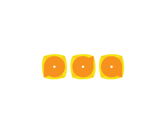
Logo done for a friend's company. Florist.
Status:
Nothing set
Viewed:
12105
Share:


Lets Discuss
Kwaku my friend, you've killed this one! I really love the idea of the mark, you're client must be crazy about it! GREAT WORK!
ReplySoory Houston, I'm using my hip hop lingo, it's all good... This one is killed, trust me, killed hard! BBRRRAAAQQQ! Love it...
ReplyAmazing. The space between mark and type may be a touch too big but I love it anyway.
ReplySuper, Kwak :-D
ReplyThank you all guys !*Art Machine - yes , I will reduce it , thanks !*Muamer - please add me on your gmail chat ( I can't do it by myself %3BP )
ReplyOK!
Replylooks really good, great job
ReplyVery nice work kwaku.
ReplyA beaut!
ReplyYour friend must be very proud of this.
ReplyHate to be crude, it may just be my mind but I see something that isn't a flower... but is quite, um, feminine?
ReplyWhat's the name of the font used as a base for the type? Or is it so strongly modified that it isn't recognizeable?
ReplyYeah, I love the type but I get the same feeling as artboy.
Replyyeah, cool one!
Replyartboy said:*%22Hate to be crude, it may just be my mind but I see something that isn't a flower... but is quite, um, feminine?%22***That's sealed it for me then is EVEN BETTER than I previously visualized! :)
ReplyThis is a wonderful mark. Nothing but praise.
ReplyGood Shit! I like the way you used a single shape to create it. Kick-ass!
ReplyNice and clean %3B) good job! :)
ReplySuperb. LOVE THE TEXT!
ReplyExcellent! Strong!
ReplyVery cool.
ReplyPlease login/signup to make a comment, registration is easy