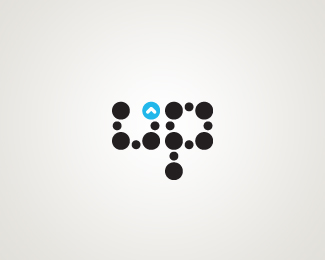
Niqo
by crislabno • Uploaded: May. 17 '08 - Gallerized: May. '08

Float
(Floaters:
11 )
Description:
Niqo - candy/lollipop company
As seen on:
Niqo
Status:
Nothing set
Viewed:
7743
Share:
Lets Discuss
Sweet.
ReplyOh, the NI might be a little tight.
Reply@gthobbs: thank you very much , I think it's just a visual feature of dual %22O%22
ReplyVery nice, Kwaku.
ReplyThe colours are great!
ReplyExactly what climax said. You have to compensate for visual balance.
ReplyHate to be the negative Nancy on this, but it doesn't feel like a logo for a candy/lollipop company. Shouldn't it be more playful? It's a great logo, just doesn't seem like the right fit for the company.
ReplyGood points, Climax. I suppose if it is for a more mature and hip crowd, than this is very effective.
ReplyI like it ... minimalistic but creative and of course well executed.
ReplyHey, nice job with this one, you should take out the inside line of the Q..%0D*%0D*Nicely done though
ReplyWell its nice job though.. But.. in the 1st time didn't think that this is candy company.. But its nice.. Kwaku, I wonder how the black and white logo looks like..
Reply@ClimaxDesigns / gthobbs : oh , yes indeed. but isn't it %22illegal%22 to operate with kerning like this ? I mean , Shouldn't spaces have the same distance?**@Ocularink: That's true , but when I designed it , I was following the same rule that Climax said a couple of thoughts above. Thanks :)**Thanks guys for the comments !
Reply@ClimaxDesigns: I didn't say anythin about black and white
Reply@clashmore: I've never said that. I am webdesigner , not logodesigner so that makes big difference I guess
ReplyKerning between rounded letters is never equal to kerning between straight letters.
Reply@gthobbs: Thank you , I'll keep that in mind
ReplyThe more I look at it, the more I like it. The N and I might need to be spaced out a little, though. Such a progressive candy shop!
ReplyPlease login/signup to make a comment, registration is easy