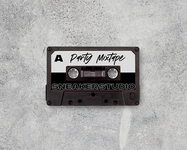
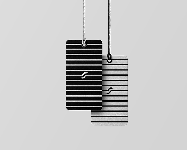
SneakerStudio
by crislabno • Uploaded: Jul. 06 '19 - Gallerized: Jul. '19

Float
(Floaters:
27 )
Description:
The SneakerStudio brand was created in 2015, in the atmospheric Kazimierz, a district of
Kraków. Since then, the tenement at 55 Starowiślna Street has become a cult meetings place of people who share love for good design, sneakers and street culture.
Every day you can meet here tourists from various corners of the world, locals, young
individualists from all over Poland, as well as celebrities, musicians and artists looking for
inspiration, following the latest trends.
The SneakerStudio brand has evolved and in April 2019 has shown its new “face”, presenting rebranding, as well as new interiors during the dedicated #changetheimage event.
Our new core interaction has a lot of components; cooperation with the young generation and local artists, making projects that support talents are to form the basis for the development of the SneakerStudio brand.
And this is only the beginning of changes ...
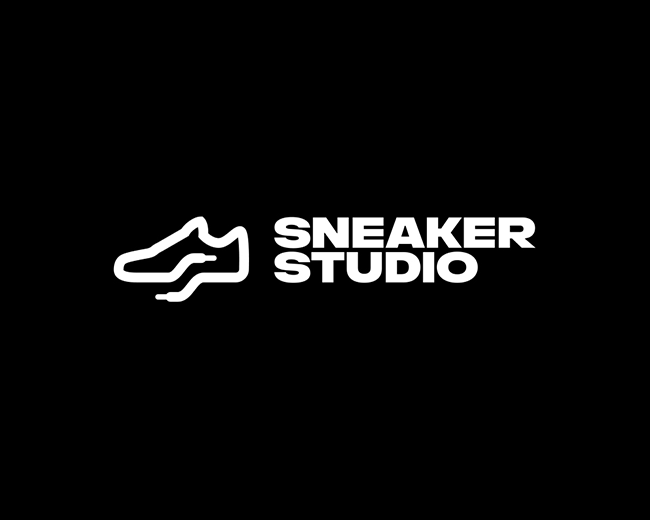
SneakerStudio is a premium sneakers company with roots.
The proposition we've developed with the client is a multidimensional solution.
We can see sneakers icon, as a real but invisible reference to the profile of the company's activity and its history.
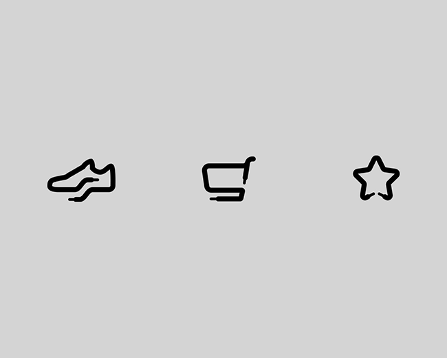
Mark constructed from shoelaces, which are the basis of the entire visual brand strategy. They are a definite "hidden" symbol of pop culture. We touch them practically every day, and they are an integral part of Sneakers. It is also a modular basis for further iconographic expansion, i.e., progressive creation of icons from one broken line, which is a shoelace. The possibilities of the brand's development are vast, and also, very flexible depending on the event and the place of application.
We hid the first letter of the "S" brand as a strengthening of belonging to the brand.
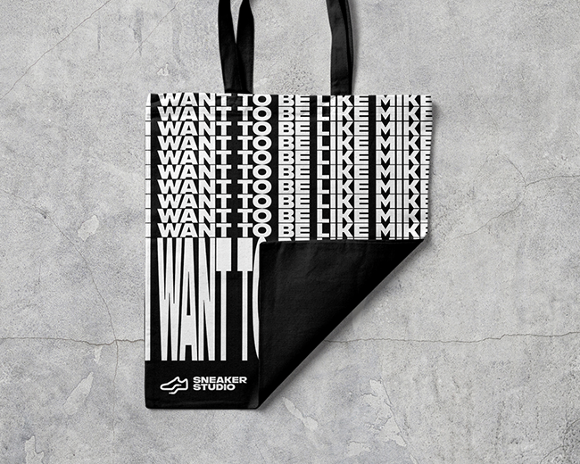
Large typography, distinctive, heavily inspired by the '90s and contemporary pop culture, creating the sense of a premium brand.
More in the next shots, thanks!
Full presentation at Behance:
https://www.behance.net/gallery/80936901/SneakerStudio
---
I'm available for the inquires. Let me know how I can help.
As seen on:
https://sneakerstudio.pl/
Status:
Client work
Viewed:
13,964
Tags:
identity
•
logotype
•
design
•
designer
Share:


Lets Discuss
nice|
ReplyLove this one!!!!!!!!!!!!!!!!!!!!
ReplyVery Nice :)
Replycheers!
Please login/signup to make a comment, registration is easy