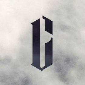
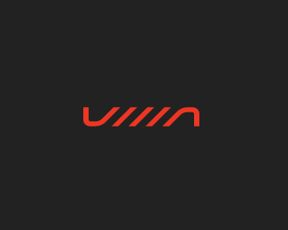
typoden
by crislabno • Uploaded: Apr. 03 '10

Float
(Floaters:
26 )
Description:
upcoming typolovers website.
Status:
Client work
Viewed:
2685
Share:

Lets Discuss
this looks lovely and elegant.
ReplyBrilliant! This is just too clever, Cris!
ReplyBeautiful type!
Replythe t looked like L to me...but man, what a beauty...dig it
Reply@vintage_chic - thank you, I'll definately let you know when it stand up :)*@kathariney - I'm glad you like it : )*@pierro, @fanego - thanks guys!*@nitish.b - true, t letter was pain.*
ReplyVery nice, Cris. One suggestion though: I suppose this is mainly for web, so I'd suggest to lower the contrast between the line thickness a little. The fine lines disappear too easily on screen and in small sizes so I'd make them a little thicker.
Reply%5EYeah. I really like your style of typefaces which is a very nice mix of organic and geometric.
Reply@Julian - thanks bro, and you're right about thickness - I will adjust it a little for sure*@Dalius - haha, maybe one day, when I will be old and have enough knowledge to do so, my friend. I'm glad you like it!
Replylove it, mate, read it perfectly at the thumbnail size.
Reply@Euan - thank you mate : )**btw, version on different bg: http://www.digart.pl/zoom/5136679/typoden.html
ReplyLike it, it's strong but subtle, so, oh, please, please do a typeface from this. You've got the skills %26 there are like enough extremely easy-to-work-with apps by just importing vector files and scaling :)*
Replyzapomnialem powiedziec krzysiu, ze zajebiaszcze.
ReplyHot type Cris! Hot indeed.
ReplyHow's this project going Cris?
ReplyPlease login/signup to make a comment, registration is easy