Description:
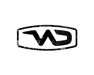
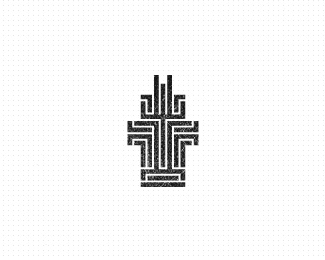
New identity for Dutch based wakeskating team Winchingdutchmen. Obviously the creation of the brandmark was based on the shape of a wakeboard.
© Gert van Duinen | cresk design
As seen on:
cresk
Status:
Client work
Viewed:
6900
Share:

Lets Discuss
Cresk, this is pretty nice. Though I didn't see the %22W%22 -- I saw an N and D there. Wondering: what's the white stuff/markings mixed in with the design?
ReplyAwesome!
Replythanks Marvin k!
Reply@JF Thanks, but from all the people who took notice, not a single one suggested the same. Maybe it's a subjective thing...?
Replylooks like a wakeboard, great job
ReplyPlease login/signup to make a comment, registration is easy