Description:
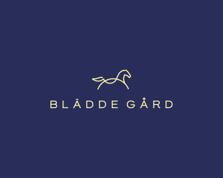
proposal for a stud farm.
Status:
Work in progress
Viewed:
28424
Tags:
posh
•
horse
•
steed
•
stud farm
Share:






Lets Discuss
Wow mark!!! Markissimo!!!
ReplyAs I said before this one is so classy and stylish.
ReplyAlena, Daniel thanks a lot:)
ReplyReally nice mark Deivdas, I think you could simplify it even more and cleaner if you reverse the tail. Go over top and under and end at the butt.
ReplyHope that makes sense, it will also balance it out better with the head IMO.
Reply^ that could be worth exploring.
ReplyThanks Mike, i tried this option. Way i presented it looks more like real running steed.
ReplyOk, just to seem to lose the flow at the tail IMo. still good.
Replykinda like more of this flow. http://logopond.com/gallery/detail/86187
Replyfine lines
ReplyWow, fantastic work!!!
Replycoool..........!
Replykilling mark superab
ReplyHope this makes it!
ReplyThanks for support everyone, approved:)
ReplyEverything is perfect on this one. I like it.
ReplyFloat!
Yeah, this horse is fantastic.
ReplyBrilliant mark love the flow
ReplyAgree with Logomotive, the logo is nice and clean but the horse reminds me of a rocking horse chair or some sorts.
Replysuper
ReplyLikes...But will make the head a lil smaller. Looks a lil uneven
ReplyBest on page.
ReplyVery cool mark
ReplyReally nice mark Deivdas
Replyimpressive.
Replywhat is the typeface used here?
ReplyIts custom.
ReplyPlease login/signup to make a comment, registration is easy