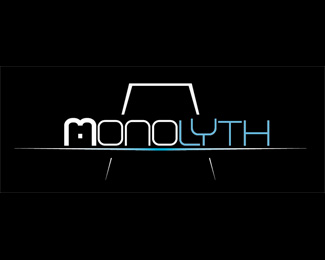
Monolyth
by closed_up • Uploaded: Apr. 18 '08

Float
(Floaters:
0 )
Description:
A revision of the another one posted here, with a different typography
Status:
Nothing set
Viewed:
1344
Share:
Lets Discuss
I like this one best. Reminds me of 2001 Space Odyssey...looking up at the monolyth
ReplyHi friend! I like your type face! I like this logo, my only question is on the thick to thin... Is it too thin to match the weight of the font? Or when it gets bigger would it compete with the font? Wold that be a bad thing to be heavier than the font? Anyway just thinking. Nice start!
ReplySorry... thick to thin of the %22monolith%22 in the background (behind the type) is what I was referring to. I was not clear on that before.
Replykriecheque: In fact, that was the main idea, the server's cabinets are a lot like the monolith of 2001 (that's was the first impresion the client got when he first saw one) And I liked the idea too, so did this design to ilustrate it (also there's the blue color (IBM joke of the movie) %3B) )*Lifesaverservant: Maybe you're right, I will try to strengthen the line thicness just to see what happen, but I don't think that I will remove it, it's a very important element of the logo, it wouldn't say the same things without that monolith. :)**Thank you for the feedback.
ReplyPlease login/signup to make a comment, registration is easy