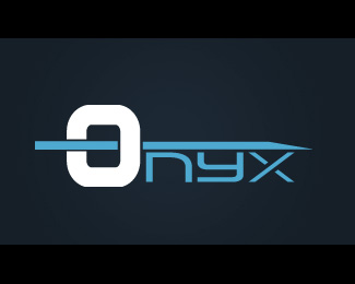
Monolyth
by closed_up • Uploaded: Apr. 18 '08

Float
(Floaters:
0 )
Description:
Changed the "i" of monolith, because it seems more interesting this way.
Status:
Nothing set
Viewed:
1153
Share:

Lets Discuss
I like it, except for some reason it looks like the Y is off balance. Maybe because it is higher than the other letters.
ReplyYeah, you're right, I will have to fix that, anyway probably I will change the typography, I like this one, but the client don't like it, so if I can't convience him, I will have to change it. But I will try with the %22Y%22 adjusted.*Thank you for the feedback. :D
ReplyI like the mark, the kearning looks a tad peculiar and I am not sure if the lines the background might hurt the design... I kind of like it with just the line stroke underneath..but hey thats me. good job though, I tried using this font (01 digital I believe) one time, and the client didn't like it as well... so you arn't alone :)
ReplyPlease login/signup to make a comment, registration is easy