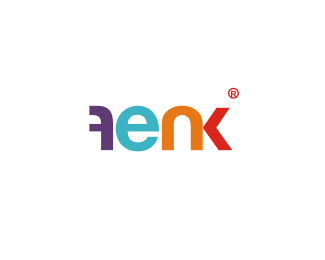
Float
(Floaters:
43 )
Description:
Logo for advertising agency.
Status:
Client work
Viewed:
10052
Share:
Lets Discuss
I really like this. but only thing is, some people could read the f as an A.
Replyvery nice colors*
Replyi agree with waggit
Replyyeah! love the colors.
ReplyIf you extended the top curl on the f slightly, it may remove any 2nd thoughts as to if its is an A or an F**I like this though :)
Replyi read 'fenk'.. no problem.. very cool, modern, wonderful colors %26 has 'last-ability'!
Replyreally nice :) I agree with nido. It reads fenk easily. Good Job man %3B)
ReplyWhy can't the F read left the right. If the flip was part of an idea then it has a purpose. please explain?
ReplyWhy can't the F read left to right. If the flip was part of an idea then it has a purpose. please explain?
Reply10x all :),*jonnyd - My english is not so good so i'll try to explain the best way i can. There are 2 reasons behind that decision. One is the stems of 'n' %26 'f' opposed to the 'e' and taking equally negative space. The other one is that it makes the logo stand out very well, which makes it very memorable. And yes to someone it is hard to read, but that is an acceptable risk that i and the client decided to go with.
Reply%5EI think it' excellent... is it in use anywhere yet?
ReplyLove the colors too. I also didn't have any trouble reading it. The F could be a little wider. It doesn't seem to occupy the same amount of space visually as the other letters. The N could be just a hair narrower too...maybe not though. All in all, it looks great.
ReplySorry, but the K creates bad/awkward kerning.
ReplyIf you reduce the width of the N and widen the F, I think you'll eliminate that %5E %5E problem.
ReplyOk Cleos, Ill have to live with this one for while. Just a thought... The characters are all unique apart from the 'e'. The 'f' is opposite, the 'n' has no back and the k is an semi illusion. If you could make the 'e' unique in any way I think it will be much stronger?
Replyye ye yeee %3B))))
ReplyLove the choice of colours in particular.
ReplyGreat colors and form !
ReplyPlease login/signup to make a comment, registration is easy