Description:
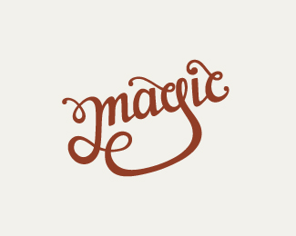
Hand drawn lettering playing around with different curves and heavy contrast between thick & thin strokes.
Status:
Just for fun
Viewed:
2103
Share:


Lets Discuss
Really nice as usual, Claire. Seems like the bottom part going from the 'g' to 'm' could use some more %22curvature%22 to it...kind of flattens out at the bottom. Other than that I dig it.
ReplyGreat stuff as always Claire! %5EI may have the same thought on the 'm/g' %3E Perhaps a single twist would do it? Also digging the 'ic' ligature, but I'm getting a little taste of an 'e' on the 'c' %3E probably just because it's kind of unusual...
ReplyHey Claire, I would shorten that leg from g to the m, too many light is there I think, what do you think? Then it will be perfect imho, nice colors.
ReplyThanks a lot for the comments guys! Glad you like it.**Hmm good points about the 'g' to 'm' stroke%3B it does look like it could do with some tweaking. I originally didn't want it to stray too far from the rest of the word, which is why it ended up flat-ish. I'll mess around with the curves though and see what I can do with it.**Michael, I also though the 'c' could look too much like an 'e' at first so I kept the loop quite small and thin. I'm hoping it works in context, as it has a similar treatment to the 'g'.
ReplyPlease login/signup to make a comment, registration is easy