Description:
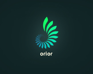
Orior offers graphic design and prepress solutions. The word comes from latin and means to rise, appear, become visible.
As seen on:
My Behance
Status:
Client work
Viewed:
44254
Share:


Lets Discuss
Nice mark. You captured the meaning of the word well.
Replysweet, agrre with occular on this one%3B the mark is perfect!
ReplyThanks Ocularink and birofunk :)
ReplyAwesome, nice job!
Replyvery nice! i really like the type too, but it seems a bit small.
Reply%5E i agree. Nice mark. Type need some love perhaps. I am not so fond of cocon when set in lowercase. That %22i%22 is always bugging me.
ReplyThis is a really slick mark
ReplyOutstanding. Thought about posting a single complaint about it, but couldn't come up with one. Just elegant, and nice to look at. Good job.
ReplyReminds me of the new Delhi 2010 logo for the Commonwealth Games.
ReplyThanks for the comments, everyone. *Well, cocon seemed a good choice considering the mark. Fixed the i and updated the logo, thanks for the reminder logoholik and uneekgrafix :)
Replyyes, very nice mark for the name. Great work!
ReplyBeautiful mark. I agree that the type should be bumped up a tad.
Replygreat!
ReplyCool Thinking :)
ReplyGreat!
ReplyThis is great. I love it.*Which program did u use to realize it?
ReplyThanks again everybody :)**AuraRinoa: It's done in illustrator, but the array of the shapes was done in 3dsmax. I tried to do it by hand in illustrator but I remembered 3dsmax has great array tools and it saved me quite some time :)
ReplySeriously a great logo. Love the mark. Mind me asking you if you just rendered out the mark in 3dsmax? Or did you render out the mark as an .eps in 3dsmax then open in illustrator?
ReplyThanks, xeo4ke, if I remember correctly, I only exported the shapes/splines from max to an autocad file format and then imported it in illustrator. Everything else has been done in illustrator.
Replywell done, I agree about increasing the logo size. Great job man
ReplyLove the glowing gradients :)
ReplyI don't see much similarity between the Delhi logo either but this one is virtually identical.**http://www.ihr-zuger-zahnarzt.ch/
Replybeautiful piece... i'll take choerte's word for it.
Replyvery good-looking logo, reminds me of something natural and organic.
ReplyWhy is this not in the gallery? Maybe it was at some point...no?
ReplyGood looking one!
ReplyPerfect ammonite, nice drawing.
Replygreat concept and a flawless execution.
ReplyHi there, I love the execution, color and attention to detail in your work. I have a small startup and we are looking for a designer to help with our branding and I would love to work with you. Please let me know if you are interested. Thanks J
ReplyHi there, I love the execution, color and attention to detail in your work. I have a small startup and we are looking for a designer to help with our branding and I would love to work with you. Please let me know if you are interested. Thanks, J
ReplyI've found a similar logo in a Taschen book:
Replyhttp://shinzza.wordpress.com/
Please login/signup to make a comment, registration is easy