Description:
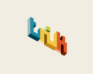
Trik means trick in english. Company does mostly 3D vizualisations and design. Inspired by Oscar Reutersvard's impossible art.
As seen on:
My Behance
Status:
Nothing set
Viewed:
3324
Share:
Lets Discuss
I think this is a cool start.. Coincidentally, I've been trying to work out a similar solution for a gig logo. I like everything except for the readability, which is probably the most important part.. Separating the r and the i more could help.. maybe where the terminal of the %22r%22 normally is have it drop back down at a 60 degree angle to the stem. Anyways, very cool. Kudos.
ReplyG.R.E.A.T.
ReplyThanks. Yes I was concerned about the readability too. Guess I'll have to work on it more.
ReplyCool! The colors is awesome and all-on-all a really interesting logo.
ReplyI really like the style and coloration here. Nice work.
ReplyPlease login/signup to make a comment, registration is easy