Description:
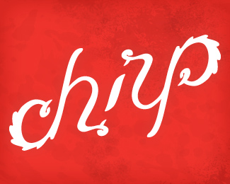
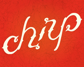
Identity for my freelance business, ambigram style. I'd love feedback. Colors are worked out and there's now a feathery look to it.
As seen on:
behance
Status:
Client work
Viewed:
3230
Share:


Lets Discuss
just... juicy!*I like its 'birdness'...*such a cute design that dances through the red background.*congrats :)
ReplyLooking great! At scale, I think you might have to bump the seperation lines at the ends of the letters just a bit so they don't get lost...perhaps small wedges in place of the lines if you catch my drift? All in all a very solid mark! Everyone loves a good ambigram! :)
ReplyThanks guys! I was going for birdness, so that makes me happy. Michaelspitz, thanks for the input, I think that's a great solution!
ReplyRevision uploaded...
ReplyExcellent! It's much easier to read those separations now...you could probably even widen/smooth them out just a bit more on the inside points, however all in all it's looking very nice indeed! Well done! :)
Replyi love ambigrams.. :)
Reply%5E I don't think it was a personal attack on you David. It seemed more like a--%22Hey, this is really good so I'll use the phrase 'Why isn't this in the gallery?!%22 to describe it.%22**That being said, this is lovely chirp.
ReplyThanks all. It's an honor to be in the middle of that. :)
ReplyGood work!
ReplyThis is an awesome ambigram!
ReplyWow Todd, really nice ambigram work!
ReplyPlease login/signup to make a comment, registration is easy