three birds
by chepooka • Uploaded: Mar. 25 '09

Float
(Floaters:
2 )
Description:
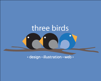
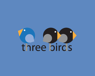
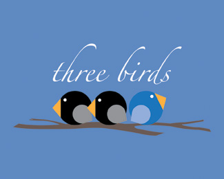
my personal logo revision #4... others are in my showcase
Status:
Nothing set
Viewed:
1174
Share:


Lets Discuss
I definitely like this one the best, with the slightly smaller birds. Is there a reason why the bird's legs can't be black? I think the orange really interferes with the reading of the name. It makes me stumble a little when reading because i disassociated the ascenders with the 'h', 'b' and 'd'. I think it may be more legible if they were all black, and it wouldn't really interfere with your illustration. Just a suggestion, b/c otherwise i think it is a great mark!
Replyis very well thought out, excellent design
ReplyPlease login/signup to make a comment, registration is easy