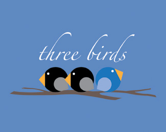
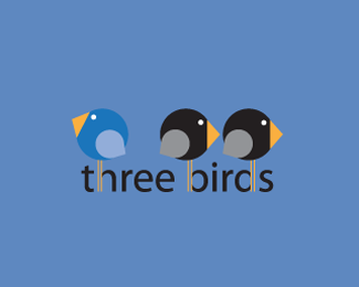
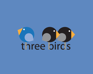
cerise's version sounds good as a simplified version.**I like the branch to ground it and also because of its looser shape against the roundness of the birds.**The bullet in front of design and end of web are not needed.*The three birds font treatment is not quite resolved.*As cerise said, try it underneath. How about all caps, maybe in a lighter version of the same font.*

Lets Discuss
Love the birds, I would delete the branch %26 tagline and move three birds text underneath...IMO
Replycerise's version sounds good as a simplified version.**I like the branch to ground it and also because of its looser shape against the roundness of the birds.**The bullet in front of design and end of web are not needed.*The three birds font treatment is not quite resolved.*As cerise said, try it underneath. How about all caps, maybe in a lighter version of the same font.*
ReplyPlease login/signup to make a comment, registration is easy