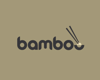
Float
(Floaters:
62 )
Description:
For asian food industry.
Status:
Nothing set
Viewed:
12781
Share:
Lets Discuss
ooops
ReplyDisregards the ooops
ReplyVery nice. I like this one. :) Would look good in 3D signage.
ReplyI like it, maybe I would change the color saturation up but still its very symphatic logo. BTW used font reminds me quite known BREMBO logo.
Reply@hindmarshdesign thanks%0D*@janzabransky cheers for the feedback, thoughts gladly received%0D*
ReplyNice and clean. Good work, cerise.
ReplyThanks Roy
ReplyWorks for me. Nice job!
ReplyCheers Kevin
ReplyNice work Cerise.
ReplyThanks Thomas
ReplyI think you've nailed this one :D
ReplyMight be cool to have a couple tiny leaves coming off the chop sticks (very clean and simple ones) to tie in the bamboo theme
ReplyWell done again!
Reply@revolve @Lawrence @Fogra - Thanks for the thumbs up and comments
Replyyummy.
Reply@ Smartinup - Thanks for that %26 @tconrad Cheers
ReplyI love it, really clean and simple :)
ReplyCheers Tiko
Replyneat!*good work...
Replycerise, Ok I'm going to be honest here. This is very clean and %22precerise%22 however I keep reading it as bambo, and maybe I'm the only one so don't worry because no one else is reading it that way.
Reply%22Precerise%22 HA - SO! you are talented and funny. %0D*%0D*Re.. Logo Mmmm might look into that, I actually had the lower half of the bowl looking more like the bottom of an %22o%22 at one stage...might revisit that. Thanks for commenting and keep on inspiring
ReplyI am over horse logos!!!
ReplyNot other peoples horse logos of course, if you see my showcase, there is a bit much horsey action goin on, I would love to do a logo for a band or perhaps a sushi bar.... ok that's it no more horse logos
ReplyDude, what if band named %22Horse Power%22 or sushi bar %22Red Horse%22 needs a logo? %3B)
Reply@rahulgabrielle thankyou so much
Reply@ Type08 Horse Power - HA! Sushi - Red Horse - Tasty Lol
ReplyIf you rotate the bowl on the horizontal axis towards the viewer so we're looking into the bowl more then we'd see the back of the top lip and the front bottom of the bowl - it would make more of an %22o%22 shape, which might help.**Just a thought.
ReplyCheers Cash and sdijock, looks like this needs a bit of an alt. I have something in mind and when I get time to do it in this busy Harness racing environment I will get onto it.
Replyexcellent design, clean and simple, i love it
ReplyThanks Snarl...went to your showcase and there was nothing there! let us know when you get some logos up.
Replyit does read better now.
ReplyThanks Logomotive
Replyamazing...dunno if that has been answered alredy but was the font custom-designed?
ReplyThanks Jeropp - It is a customised font, can't remember the name of it originally, somebody will probably remind me. I curved some corners and shortened the b
ReplyNice, I like it. Sort of reminds me of a logo I made that's on here: %22bahmboo%22
ReplyThanks dhalarewich
ReplyAmazing work. One of the most creative things I have since in 08. I have taken a liking to this. Wheres the inspiration from?
ReplyThanks Khaleel, kind words. No inspiration in this one, just had a thought in my head of chopsticks/bowl being incorporated into the letter O.
Replyabsolutely awesome, actually your best work.**iLuv.
ReplyThanks :%7E)
ReplyFloated this a while back but never commented. I really like it.
ReplyThanks Glen keep up the good work
ReplySick of watching this logo! It got 3465 comments man, flipping out every day! :) :) Great job, Cerise! :)
ReplyThanks Alen, congrats on the featured gallery...well deserved!!
ReplyThanks a lot Cerise!
ReplyNice work Cerise!
ReplyThanks Tobias
ReplyThanks Dalius :-%3E
Replybrilliant AND tasty!
ReplyCheers Justin
Replysimple and lovely font. my kind of logo.
ReplyThanks a lot Verg
ReplyPlease login/signup to make a comment, registration is easy