Description:
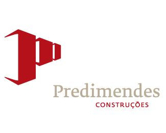
Corporate Identity for a Construction Company named PrediMendes. The brand developed is an effective stylization of the P M initials of the name’s company into a typical buildings form easily identified and remembered.
As seen on:
http://www.predimendes.com/
Status:
Nothing set
Viewed:
6071
Share:

Lets Discuss
One of my favourites of your work.*Brilliant.
ReplyThanks Art Machine, I think the Building are much more easy to catch than the PM glyphs.
ReplyLooks remarkably similar to Wright Contracting- http://logopond.com/gallery/detail/4913
ReplyIndeed :) It' the same concept.
ReplyPlease login/signup to make a comment, registration is easy