Description:
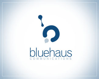
Let me start by explaining the name first. "bluehaus" is a made up word that I created by combining a lot of things about me and things I enjoy. Many people notice the similarities to the German school Bauhaus. The Bauhaus style became one of the most influential currents in Modernist architecture and modern design and I quick enjoy it. I have German blood in me and enjoy the colour blue. I threw them all together and came up with the word "bluehaus".
As for my mark, it's a combination of a couple of different things. The first and probably the most obvious is the overall shape of a lower case "b". A friend once told me that I must be dripping with creativity and that always made me laugh. So I used a drop to create the upper part of the mark. The lower part symbolizes the process of taking my clients all the way around from point A to point B making sure nothing is overlooked in every project.
In a nutshell, I think that's about it! Hope you enjoy my mark and appreciate all the thought that went into it.
As seen on:
bluehaus communications
Status:
Nothing set
Viewed:
2362
Share:



Lets Discuss
Awesome work, love the concept.
ReplyPlease login/signup to make a comment, registration is easy