Float
(Floaters:
5 )
Description:
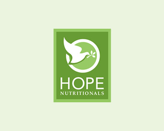
Logo for Hope Nutritionals
Status:
Nothing set
Viewed:
4386
Share:



Lets Discuss
Simple and clean. I wouldn't make it too small though because your %22NUTRITIONALS%22 type will be illegible.
Replyyeah i actually made a version were the dove symbol is integrated in the O in HOPE, and the word nutritionals below it. %3D)
ReplyThis is a nice unit.*The Hope type is clean with the perfect circle.*Works good in monochromatic.*I like the green choice.*
ReplyReally nicely done. I'm loving the shadow behind the dove. Clever. :)
ReplyPlease login/signup to make a comment, registration is easy