Description:
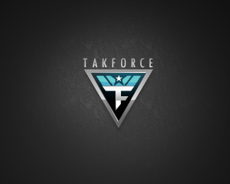
new logo for a client of mine, suggestions please, thanks.
Takforce - is a gaming site, cs, quake, etc
** Re edited some parts **
Status:
Nothing set
Viewed:
2245
Share:






Lets Discuss
I'd say nix the idea of merging an F with a T and just use the T on the shield. I think that'll help balance out the negative space. Also, you can try extending the vertical bar of the T down into the point of the shield a little more. Keep an eye on all your angles. They should all match a little better. Namely the angle on the bottom of the T. Seems off. These are all nit picky things that I think will bring this to another level. One other thing, position the wordmark a little higher above the shield. It needs a little room to breath. Coming along nicely though. :-)
Replyreedited some parts , ty ocular link
ReplyThat looks better already. :-) It's a great looking logo for your client.
ReplyPlease login/signup to make a comment, registration is easy