Description:
Taca Version 1
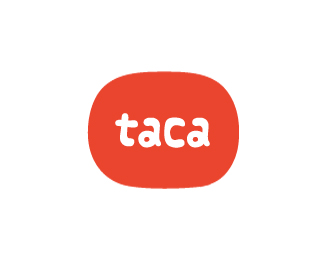
Taca is the Irish word for support. They are a charity that help orphans and children infected with HIV/ AIDS in Uganda
Status:
Nothing set
Viewed:
8429
Share:

Lets Discuss
this could be just me, but first thing that comes up in my eyes is... Japan. I'd suggest to use a different color scheme...
ReplyHi Katherine, the colour scheme was selected as this is the colour of the childrens uniforms in Uganda. A huge part of what the chairty does is to get these children back into education. **
Replyhm, very nice concept!
Replydigging this...:)
Replyworks good.
Replygreat cause. I think now that you changed the shape from a red circle into a rounded rectangle, it doesn't speaks %22japan%22 to me anymore. and personally i thnk this shape ties nicely with the type, which is lovely btw :)
ReplySweetness!
ReplyThanks for all the comments guys, i really appreciate it!**@Katherine: Sorry I orginally uploaded an older version of the logo by accident. You were too quick and commented before I realised! Glad you like the logo now.
Replylovely. The proportions are perfect.
Replycheers Euan!
Replyexcellent. Should be in the gallery imho.
ReplyLooks great! Love the lettering!
ReplyI like the feel. friendly to children.
Replythanks guys, appreciate the comments!
ReplyLike it.
Replycheers Sean!
Reply%3Ca href %3D %22http://www.logonest.com/2010/02/taca/%22%3ESelected by LogoNest%3C/a%3E
Reply%5E Well deserved!
Replycheers Bojan, congrats on your recent success!
ReplySuperb work.
Replysweet. I really like colors and type.
Replylove it, very playful :)
ReplyThanks for all the comments guys and to David for putting this in the gallery..honoured to be amongst such fine designers!
ReplyPerfect shape for that font. Complements it well- good job!
ReplyI like. I'd tweak one of the As to make it different from the other just to pushe the hand crafted feel.
ReplyI like this. Because it's mimicking hand written text it feels like it would make sense to make the %22a's%22 less alike in shape.
ReplyOops, someone else already said it....*
ReplyGreat! So soft and it nice coloured!
Replythanks for the comments guys, i'll look into tweaking the a!
Replysimply... brilliant.
ReplyLovely work.
ReplyI really like the logo. Is the type completely original or is it basedon an existing typeface?
Replycheers nido %26 mabu, humbled by all your comments!**@logo design monster: the type was based on a font called vannilla
Replylovely, i like it!
Replynice type %26 colors!
Replythanks Claude %26 Saurabh...really appreciate your comments!
ReplyLove this!
ReplyThanks for the comment Joe!
ReplyGreat logo, mate!
Replythanks Davi, glad you like it!
Replyalways liked this one
Replycheers Andrej!
Replyyeah me to. just added to my favs.
Replythanks Paul, means a lot mate
ReplyPlease login/signup to make a comment, registration is easy