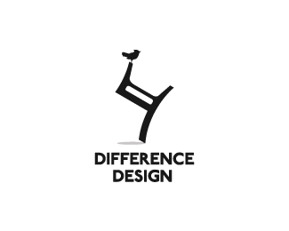
Float
(Floaters:
85 )
Description:
This company produces of unusual homes.
Status:
Client work
Viewed:
7555
Share:


Lets Discuss
guys you have seen similar marks?
ReplyNot that I can think of. Looks sharp.
ReplyThanks Matt!
ReplyNice work.
ReplyNope, and this is an original idea for me. Fine curves.
Replyhehe.. this is cool, nice balance!
Replyno havent seen anything like this, really like it. well done Bigoodis.
ReplyGreat work. I really like the feel of this. Cool!
ReplySorry mate found this today*http://www.merrycox.com/images-merry-cox/mapchair.jpg
ReplyThanks for all comments guys!*@cerise: Thank you for your comment. While I was asking only about the similar logos. In connection with this logo: I come to this like this http://cl.ly/b8c7469cc5deb6c4f8f8 (this letter of the Russian alphabet). This is not about the bird and the chair. Although about them too :)
Reply%5Echair is very similar to the letter and the letter begins the name of the company :)
ReplyAll good lovely logo...Floated
Replystrange, yet interesting concept. nice work.
ReplyI don't get it. Could anyone fill me in? Sorry man, I may be a little slow today.
ReplyInteresting.**LOL! @cerise.
ReplyThanks for the comments guys, realy appreciate it :)**@mabu: this logo I'm doing for the design studio.*Logo has several definitions:*- Balance*- An opportunity to solve any problems*- The initial letter of the name*- Bird - it's skillful and a sign of free
Replygreat idea bigoodis.*I would try to make the chair shape a little bit thinner.*It looks heavy right now for a small birdie...
ReplyI think the heavy chair adds to what makes this so special - its so unlikely as to be %22unpossible%22. And I have a hunch that it will probably also help the letter association standout and be more legible at small sizes.
Replyi love the visual...
Replythanks for the comments guys :)*With the shape and size of the chair:*I have not decided yet. But I think that it is a massive form is more appropriate here. At the expense of small size: within a reasonable mark scaled perfectly normal. If need a very small size, the logo can always be simplified.
Replyreally nice visual.. cool
Replyyes %3B) I like it!
ReplyThanks for nice sounds guys!
ReplyWow it's yours, Van':) Perfect composition
ReplyThanks a lot Nikita :)
ReplyThanx:)
ReplyCool. Great stuff.
Replythanx dude!
ReplyPure beauty Ivan.
ReplyThanks again Radek :)
ReplyThat is one mighty fine looking sitting device if I may say so myself.
ReplyThanks mate :)
Replyunique!
ReplyThanks mate!
Replyhah, so cool!
ReplyThanks:) recently that an unused version found its owner %5E_%5E
ReplyLucky owner %5E_%5E
Replylove this mark:) looks amazing:)
Replythanks
ReplyI see a girl with laptop, haha!
Reply%5Elol, now I see it too!
Reply%5E I see the laptop, but where's the girl?
Replywow! where?
Replyhaha. just look at the thumbnail...she is there! Nice find folkypaul!
Reply%5E I don't know what you are talking about guys, but it sounds illegal. Where is she? :D
Replydo I need a permission to explain? :)
Replyhttp://cl.ly/2V3G2c2D1t2y392I0a0v %3C%3C she here? lol
Replysomeone please show where :D
Replywell.. I'll try :)... if you imagine the birds body as the girls head, the birds tail as perhaps the girls hair tied back... then follow the line down to form her upper body, her arm out holding the %22laptop%22... and the rest her leg as though she is sitting (on an invisible chair of course)... at least that's how I see her :)... she is very much a stick character though...
Reply...and it does appear more so on the thumbnail...
Replyok, hope paul will forgive me :)*The birdie is girls head.*The girl is like sitting on invisible chair and she's holding a laptop on her knees like she's writing an email or such.*do you see her now?
Replyoh nido.....
Reply%5E OMG I saw this! :D
ReplyThanks guys :D
ReplyHeh, heh, that's hilarious!
ReplyI see the girl but I dunno how you guys think its a laptop she is holding... I mean she could be in someone's lap or doing a pole dance... but seeng a girl on a laptop......(perhaps its not what my eyes want to see).. :D lol. Nice design man!
ReplyThanks a lot guys :) Just UPD with type. Company produces of unusual homes. They found my (this) sign, when the sign has already been made :)
Reply%5EAnd their homes - a balance of practical and unusual.
ReplyThis girl got married! Congrats!
ReplyYes, something like this :) thanks
Replylmao! finally, i saw the girl.. :D looks like an Olive a bit :) Congrats, btw..
ReplyAhah :D I think it's great when the logo looks different. It's even better reflect the essence of the company now. Thanks Srdjan :D
ReplyYou guys are off your Rockers:) I see no girl.
ReplyY kak oni dodumalis.. Ja smotrel 15 min shtobi uvidit' ejo :D%0D*%0D*Super great work!
Reply%5Ei thought the same..for a month :D follow nido%60s instructions and switch on a thumbnail view (comments).. i can%60t see it here either..
ReplyIt's all I see when I look at the thumbnail now. :)
Reply%5E I get back to it too, and it has been a long time since I've tried it before and damn I can see a girl there now, haha.
ReplyI also saw it following nido%60s instructions ahaha :D
ReplyGotta be a joke or guess I'm losing my sight. Now it's ticking me off.
Reply%5E Mike, it's not a joke.
Replypositive or negative space?*
ReplyBut I do not think it's a bad thing. This rarely happens and I like it a likeness. Especially the fact that I learned about it following the %22nido%60s instructions%22 :) For Mike %3E http://cl.ly/0t232y1L3c1h3R3f1z0e
ReplyOk I think I see it, very skiny neck, little head. Nit of a stretch though?*
ReplyHa ha made my day.,
ReplyI was looking at Positive/neg. space why I could not see it :)
ReplyAll I ever see now is the girl when I see this. So funny! Is the type final, Ivan? I almost wonder what centered typography might look like given the crux of the concept in the visual is about balance. Just a thought.
ReplyI looked at it a long time and just read the instructions I saw it. Great find :D
ReplyThis find reminded me this %3E http://cl.ly/3i1r3X3p3x0z1h2V1L0T (rotates in both directions, if you look) :)
Replyto Sean: yes, type is final, I tried to do alignment on the center, but it's not the best option. The form of the sign can not do it fully (for example) %3E http://cl.ly/1s3w3s3Z1p1B183S3M2I (The right side of the sign is too heavy for center alignment)
ReplyI see. I think you would have the have the point of the chair in the center of the type to get it to work right. But I think your left aligned solution is nice, it seems to work.
ReplyLol just read all the comments and now the upside-down chair is gone and I only see the woman. And for some weird reasons I swear that woman must be wearing glasses.
Reply@Sean: thanks for the add, I think that just this version is final. It's better than the previous. Thanks and UPD.*
Reply:) folkypaul should get all the credit for seeing the %22girl with a laptop%22 first...
Reply%5E hah, yeah, but %22instrustion%22... :)
ReplyLooks good, Ivan. That's exactly what I was thinking!
ReplyThanks Sean, I agree now it better :)
ReplyHey, you've put some type here. Nice choice, fits perfectly.
ReplyThanks man :)
ReplyThat's so clever !!!!
ReplyThanks a lot Bernd :)
Reply... and what's about Gallery ???
ReplySelected for volume 7 logolounge book.
ReplyAgain, congrats, Ivan. :)
ReplyThanks for all comments Mike. Much appreciate it.
ReplyUR welcome Ivan. I lucked out and got a few of mine in there also. Feels good don't it!
ReplyReally glad to hear it, I have always loved this.
ReplyThanks Sean, congarts Mike :)
ReplyCool! Is 'Mujo' selected?
ReplyNo, Mujo was not selected..(
ReplyThese five http://cl.ly/9ycx
ReplyMaybe they'd look more closely next time. Still great! I really enjoy this selection.
ReplyI agree with you Nikita. I am very happy, actually. This is my first publication in this book :)
ReplyGreat ones, I love all of them, Ivan. Congrats! :)
ReplyThanks a lot buddy:)
Replynice concept :D
ReplySo THIS is the famous 'girl with laptop' logo!
ReplyGreat work throughout your whole showcase. Definitely feature worthy.
Thanks a lot guys.
ReplyPlease login/signup to make a comment, registration is easy