Description:
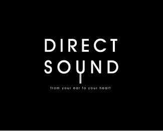
This was created for an audiophile who had gone to work for himself creating custom-made Hi-Fi speaker systems.
Status:
Nothing set
Viewed:
7019
Share:

Lets Discuss
Perfect pitch.
ReplyWhat is the extension of the 'U' supposed to be? An RCA/Stereo lead?
ReplyIt's a tuning fork if I'm not mistaken.
ReplyI like how you combined the mark and the type. It's rather unusual that you use a tuning fork to signify sound, which is good. I think we're all sick of waves as a mark already. Good job!
ReplyDoes anyone else read Soynd instead of Sound?
ReplyYea, artboy...good observation. This would be far more effective if the tuning fork was used as the letter 'Y' in a particular word. Because it's being used as a 'U', your idea seems a little forced. Even so, kudos for your cleverness.
ReplyCool idea but the U also reads as a Y.
ReplyRelevant: Thanks! The tagline is actually %22From your ear to your heart%22. I shoulda fixed that before I uploaded it.**gthobbs: Thank you very much! And yep, you got it right with the tuning fork.**shaq: Gosh I'm sick of the soundwaves... I originally had them around the fork and then got rid of them.**artboy, Ocularink %26 grubedoo: Thanks! I thought of that too%3B and I wanted to darken the handle of the tuning fork ever so slightly more, but the client approved it before I had the chance. Either way, most people seem to get the Y anyway. I wonder if it has something to do with the fact that U came from Y.... http://en.wikipedia.org/wiki/Y
ReplyLove it. I think some people will see a 'Y' and some will read it as a 'U'... in its favour, with the logotype set in all caps, it is more likely to be seen as a 'U' - I also like how you have used the tuning fork's actual proportions hence making a narrower 'U' than would be usual for this font. Simple and to the point like the best logo designs are.
ReplyPlease login/signup to make a comment, registration is easy