Bad Girl Racing
by bbquearen • Uploaded: Apr. 22 '15

Float
(Floaters:
1 )
Description:
CHALLENGE
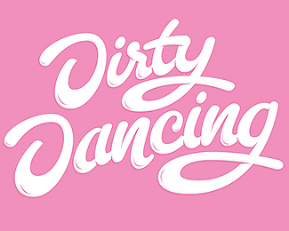
Bad Girl Racing needed a rebranding. The old logo were out of date and did not feel like them anymore. They wanted the new logo to be soft but tough at the same time. They like pink and purple but aren´t afraid of getting there hands dirty. The logo will be used on website, clothing, cars etc.
SOLUTION
The new hand-lettering logo has a classic look with some more contemporary touch. It is flirting with old racing and car industry aesthetics. The slightly cursive look symbolizes both how driven Bad Girl Racing are, and also, the actual driving. It also gives a sense of confidence, the thick strokes and the compact word image strengthen this. The logo also consists of a few soft swooshes and turns that feels feminine. Also, finally, the d & G ligature makes the logo stand out.
ABOUT MY LOGO DESIGN PROCESS
I have a streamlined logo design process. You will know what to expect during the process and I keep everything efficient and effective, in terms of time and money. Do you want to know more? Visit my site, www.bjornberglund.com, that describes my logo design process. Or, if you are ready to go – send me an email to hello@bjornberglund.com and we will get things started.
As seen on:
My site
Status:
Client work
Viewed:
1181
Tags:
Branding
•
Logotypes
•
Logotype
•
Logodesigner
Share:
Lets Discuss
Please login/signup to make a comment, registration is easy