Description:
CHALLENGE
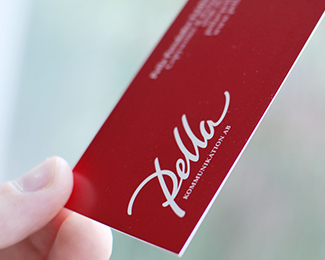
The newly started one woman show Pella Kommunikation AB needed a logo. The main service of the company will be copywriting, but Pella will also offer consulting in communication. She wanted the logo to be based on her own signature. Her idea was to have “Pella” in a more extrovert style and “Kommunikation AB” in a more strict classic typeface. The logo will be used on business cards, stationary templates, website and digital presentations.
SOLUTION
Knowing Pella very well, I intuitive went for a dynamic and clean hand-lettering version of her signature. Modern yet timeless with an ounce of 50´s design. Slightly cursive for a subtle feeling of drive and passion. Palatino Linotype was used for the text “Kommunikation AB”. The chosen color, sort of raspberry red, is warm, lively and alert. I truly believe the new logo captures the talented person behind Pella Communication AB.
ABOUT MY LOGO DESIGN PROCESS
I have a streamlined logo design process. You will know what to expect during the process and I keep everything efficient and effective, in terms of time and money. Do you want to know more? Visit my site, www.bjornberglund.com, that describes my logo design process. Or, if you are ready to go – send me an email to hello@bjornberglund.com and we will get things started.
As seen on:
Pella.nu
Status:
Client work
Viewed:
806
Tags:
Branding
•
Logodesigner
•
Logo designer
•
Logo design
Share:


Lets Discuss
Please login/signup to make a comment, registration is easy