Tom Mechler
by bartodell • Uploaded: Jul. 22 '09 - Gallerized: Jul. '09

Float
(Floaters:
43 )
Description:
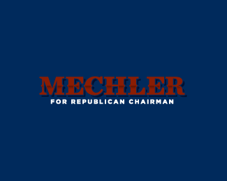
Paid for by the campaign to elect Tom Mechler for Chairman of the Texas Republican Party. This wordmark is all custom typography minus the tag line. I styled it after the wood cut lettering of the Texas past.
Status:
Client work
Viewed:
5058
Share:


Lets Discuss
Your type is Texas. Really nice.
ReplyKeep 'em coming, bart.
ReplyNice lettering Bart.
ReplyI'm Impressed considering this is custom. Kudos bro.
ReplyReal Cool!
ReplyGreat attention to detail, Bart.
Replytwo, three nudges down for the tag line maybe?...
Replyi normally don't vote republican, but i'll make an exception here, nice job Bart!! %3B)
ReplyForgive me, but...is there a reason why this logo is 'unique' compared to others? I hate to sound so negative, but....I honestly do not see anything that stands out as ultra-original. Good work on making this customized...but honestly, the 'For Republican Chairman' type is far too small in proportion to the name. And the type is not all that memorable. Again, please forgive me, but I had to ask. Congrats on getting into the Gallery.
Replythis is sooo ordinary. I do not see one single good reason why this would receive even one vote...must be inertia. or...rather, good relations ? i mean...really...
Reply%5E Customising type is not 'ordinary'. It takes real design skills to craft a type style like Bart has done here and it certainly is better than most logos on here.
ReplyJust out of curiosity: What exactly is customised about the font? It looks very natural and regular as it is. So my guess would be that only the line in the middle has been added or altered.
Replynice one bart! i love how you made the type stand out. very texan classy.
Reply%5E%5E double word
ReplyWhat an awful political logo. Where's the Red White and Blue? The obligatory 3 stars? The Optima? **I kid, of course. Nice mark! Great type!
ReplyI hate to say it but I agree with some of the naysayers here. I don't see how this logo ended up in the gallery. That decision feels like it was based on the creator's popularity and not the individual merit. The customization to the existing font is nothing extraordinary or even original. There are a lot of other excellent logos around this site that get less praise.
Reply%5E%5E Nope, Bart's not even popular. He's just a great logo designer. This logo ended up in the gallery because it shows a great attention to detail, is very appropriate for the client, is memorable and is well done. I imagine this took 10x as long to design than the other logos you suggest aren't getting enough praise. Notice the attention to detail. Perhaps some of the naysayers need a lesson on typography to appreciate this more. Perhaps.
Reply%22Notice the attention to detail%22. I mean that without any irony: It would be great to hear about it more precisely. To me, the basic shapes of the letters seem %22regular%22, as in Bodoni, e.g.
Reply%22If you have to ask, you'll never know.%22
ReplyWOW!!! This is causing a stir on the pond for sure. This logo was an experiment in typography for me for sure. I spent nearly a week straight browsing through nearly 2500 serifs on various websites. I found characteristics of quite a few that I liked and started playing with the pen tools. Once I had the basis for the framework of each letter, I then started to adjust them even further. Making sure to give balance to each letter while maintaining the visual recognition at very small sizes. This entire design process took me further into serif type study that I have never been before. From start to finish I have about 2 weeks into the MECHLER lettering alone. Some may say that is not much, and I know that it isn't, however for a political logo, with no icon, it had to be perfect. So take it as you will. David makes his own decisions in regards to the gallery, however, all of you can either ignore or float. That is your call.
ReplyHey Bart, don't worry too much about the NaySayers, most of em are using free downloaded fonts anyhow, and would not know the difference anyhow.
Reply3 very valid points raised here...**1) creating a font from scratch is *not* an easy task... at the bests of times...**2) what gets featured in the gallery is at the discretion of the site owner/founder**%26 3) (most important imo)... %22Bart's not even popular%22...
ReplyI agree with logomotive on this one. I think it's a wonderful logo and incredible custom typeface! I envy your skills, because I'm guilty of using free fonts and just changing them for my needs. I wouldn't even know where to begin in creating a custom font. CONGRATS to you on making the gallery!
Replycongrats for this custom font. it looks very pro!
Reply4. Some wouldn't recognise a good logo even if it jumped up and smacked them in the face.
ReplyOkay, with all this discussion on the work that goes into making this logo, has anyone bothered to explain to the 'naysayers' what it takes, rather than saying it's %22really hard work%22...? See it from both sides. So, to garner peace between these two opposing views....let's try this. Devil's advocate approach.%0D*%0D*To the 'font creation gurus' let's ask:%0D*1. What font creator program was used? If not a program, what software/technique?%0D*2. Was an initial type used, then customized? If not, why?%0D*3. Why would the amount of hours you put into making custom type be worthy of any more praise then those who spend hours customizing type AND a logomark?%0D*%0D*To the naysayers, let's ask:%0D*1. Why not put yourself in the other designer's shoes? What do you think it took for this concept to be developed?%0D*2. Have you ever customized type?%0D*3. Have you ever thought about instances where a logomark might distract from, rather than enhance a logo's message?%0D*%0D*I'm not a member of the United Nations, I swear. I think this sums up the gripes on both sides. Personally speaking, I'd love to hear both sides explain themselves in a peaceful, and respectful manner. Some interesting questions %5Bnot necessarily mine%5D have been raised. %0D*%0D*This discussion can only help our design process. It's design talks like this that open up minds.%0D*%0D*Peace out, yo. %0D*%0D*
Reply@relate*1. Adobe Illustrator*2. No initial type. I had screen caps of other typeface characteristics I liked, and use those as reference points to create the wordmark.*3. Because as it has been said here before, it's in the details. That is what makes a wordmark so minimal but so complicated at the same time.*Hope that sums it up for you all.
ReplyGreat job, Bart.
Replyvery well crafted. good job, dude
ReplyThanks for that, Bart. I'm sure people appreciate knowing that%3B I know I do.%0D*%0D*I especially love tutorials on how type-only logos come about. David Airey's site is great for that. Vissumo in particular is a favorite of mine %5Bhttp://www.davidairey.com/vissumo-logo-design-process/%5D.
ReplyI took a look at Bart's portfolio and saw an alternate version of the logo (Mechler was in white). I could see the detail a lot better and now feel differently about it. Kudos.
Reply%26 3) (most important imo)... %22Bart's not even popular%22... LOL!!
Reply*lundeja said: %22If you have to ask, you'll never know.%22**That has got to be the most pompous comment I've read here.
ReplyPraising the attention to detail given without knowing what work actually has been done, easily tops that. And tearing your clothes to pieces and wondering in sackcloth and ashes because someone experimented creating his customized font for the very first time, isn%B4t much better. (Take your handwriting, scan it, vectorize it and welcome to the club of font gurus in no more than two minutes.)%0D*I believe the discussions of the logos in general would greatly benefit if conformism wouldn%B4t be considered the law. When you state that this logo, regardless if good or not, appropriate or not, usable or not, is pretty close to already existing fonts is simply calling a spade a spade. The difficult part - the middle part of the E - is to the best of my knowledge using exactly the same shapes and angles as existing fonts.%0D*Ah well, and I haven%B4t even said anything about the drop shadow.
Reply@zerocommazero: Agree to disagree. I don't think it was pompous, I think it was a valid point. I borrowed the quote from Louis Armstrong who said %22Man, if you have to ask what it is, you'll never know,%22 when asked %22What's jazz?%22
ReplyThe emperor has no clothes!**Bart, you said:*%222. No initial type. I had screen caps of other typeface characteristics I liked, and use those as reference points to create the wordmark.%22**In response to your statement, I now present Bodoni Bd BT, font size 40, -3 kerning (with the exception of the %22R%22 which is -5 kerning), width stretched 110%25. The only thing missing is the horizontal line addition and some fancy shading. **Link here to my visual illustration of this point: http://logopond.com/gallery/detail/72847**There is no way, no possible way this font was built from the ground up. **Just admit it -- it's customized type only in the sense that you added a horizontal line, drop shadow, and some other effects. There's no shame in saying that, but you chose to lie about it and say it's all yours. Absolutely terrible.**The text below the Mechler name? Also not customized. Arial black, font size 9, kerning 13. At least you never lied about that one being completely yours.**So, as a naysayer I have my own question!**%3Cb%3EIs everyone so blind that they couldn't identify the use of Bodoni except barryconvex?%3C/b%3E**Listen, I really wouldn't have jumped in this discussion if it were not for the extreme arrogance of that lie, bartodell. To say that you built this from the ground up is a horrible thing to say. Shame, shame. And shame on everyone here for going along with it for the sake of kissing up.**I'll say it again...the emperor has no clothes!***
ReplyMan you are a kid. I defend my statement by telling you if you were a master typeface guru first of all you would know that the bottom text is gotham black. :) Calling me a liar, on a public forum with no portfolio to back your abilities or thoughts up is quite childish and immature for that matter. Let me say this... The Kid needs a spanking. %3B)
ReplyI'm a naysayer, my friend -- never claimed to be a guru, just observant and honest. Yeah, I'm calling you out.
ReplyP.S.: what do you say about your own behaviour? Mine is honest, even if you don't like it. Yours is not. You're claiming this is %22all custom typography minus the tag line.%22 And that you used %22No initial type. I had screen caps of other typeface characteristics I liked, and use those as reference points to create the wordmark.%22 **Answer that, rather than slamming me, and we should have a civilized discussion.
ReplyHey Kid before you go jumping to conclusions understand that there are many fonts on the market that are similar to Bodoni. Look at the Curve of the C and where it ends. The strokes are different. The serifs have curves. The Counter of the R is different. The E has taller Serifs.
ReplyTheKid, *just noticed the logo you posted (Bart's Mechler Mechler set in Bodoni Bold). Sorry, but if you think those are the same you should really get a bit deeper into the finer art of typography. You have just destroyed your own argument by posting them side by side. Good luck...
ReplyIt's Bodoni, with some tweaks. Of course there are minor differences, because he started with that font, and altered it. **He used Bodoni as his initial type. It's unmistakable.
ReplyOH and for the record Kid, Bart never said it was a font but a typeface. At least know the difference. A font is a programmed set of characters.This is just a typeface design.
ReplyListen, I knew I'd catch hell for posting this, but I really don't care at this point about defending my credibility. It's not about me. It's about an unoriginal design, one that has a lot of puffery attached to it, for what can only be perceived as LP politics. **Plus, it's not that memorable, not that %22wow%22 factor I expect from images that get into the gallery. It's a design that lends nothing as an %22example%22 for the rest of us to follow.**What am I supposed to do with the %22knowledge%22 I get from seeing this logo? Learn how to tweak Bodoni and tell the world it's a design I made from scratch, when I didn't?**I haven't even mentioned the fact that bartodell knows the site owner by his first name. **So I just did. Was that designed to let us know something? If it was meant to intimidate and/or impress me, it didn't. It did the opposite, and raised questions in my mind as to why an unoriginal logo like this would get into the gallery.**I really like this site. And I really like the work bart and others who posted here do, normally. I'm disappointed and shocked that a logo like this one would make its way into the gallery and gain so much praise. Other gallery logos are far better, and actually teach us something. Seeing Bart go on about how he created this from scratch is perhaps the biggest insult to our eyes. **As to my name, if you haven't figured it out...read Hans Christian Andersen. The Emperor's New Clothes. Or, I could just say to those who don't get my username....%22Man, if you have to ask what it is, you'll never know.%22 Hahaha.*
ReplyBravo kid.. bravo for sticking up for what you believe %26 not being scared to say it... bravo... bravo for creating a new account so as not to affect your real identity in order to be so %22brave%22... %26 kudos for getting to mention Hans Christian Andersen too... **Bodoni... No clothes... no balls... it's all the same...**just wish you'd stood up as yourself...
ReplyI'm a lurker, nido. I've been around this site for a while. And again nobody is saying anything about the type, just me. **I'm going to say this once again, it's not original, so don't tell us it is. If you want to discuss the design, I applaud it. Slamming the person who posted their disbelief doesn't make the logo any more credible.
ReplyBodoni? Arial? *Yep, this is the classic case of: *4. Some wouldn't recognize a good logo even if it jumped up and smacked them in the face.*Man, you just cemented that statement with your silly arguments... please stop it. You're hurting yourself. Go get some education or practice and come back in five years. Good luck. You'll need it with that attitude...
Replygeez, is this really happening? The kid i would say you are delusional and would also say that you have no business in having a go at bartodell whatsoever. **You are arguing with some of the best logo designers around, don't you feel that you MAY be wrong? (you are btw)
Replylundeja said: %0D*@zerocommazero: Agree to disagree. I don't think it was pompous, I think it was a valid point. I borrowed the quote from Louis Armstrong who said %22Man, if you have to ask what it is, you'll never know,%22 when asked %22What's jazz?%22%0D*%0D*That is an improper use of a quote. You shouldn't put quote marks around what you borrowed from a real quote, you should quote the exact text. That is the purpose of a quote.%0D*%0D*Your vanity shows through by presuming that I do not know anything about graphic design. Obviously, that is your interpretation and the main message of the text you supposively quoted and massacred out of context. I guess I shouldn't have offered criticism. I should just pat everyone on the back. But isn't that really an injustice just to feed someone's ego?%0D*%0D*Let's look at this a different way. Let's suppose I am just a regular joe who doesn't know a lick about design intricacies and I think this logo is nothing special. Does over-explaining the design justify the needless effort if it looks average? The simple purpose of the gallery is to show designs that are better than average, the cream of the crop.%0D*%0D*Every graphic designer has been in that boat at least once where the effort they put into a design isn't paying off, at least to what they envision in their imaginations. The over-explanation by some here makes me feel like I am looking at the exact situation.
ReplyInteresting. Bart is a very talented designer and I've never seen him put a foot wrong. And in my opinion he is not wrong here either. I know David by his first name and I would also say I'm as popular as Bart as an individual here, yet have never had a logo of mine make it into the gallery. Without the smallest amount of ego I can tell you you are wrong here. Please do more research about typefaces. Just think about the difference between Gotham and Ariel and you should realize there is an obvious difference between Bart's typeface and Bodoni. I've done serif typeface myself from scratch. I know the work he put into this.
Reply@zerocommazero Maybe I wouldn't assume that you knew absolutely nothing about graphic design if you actually had a portfolio. Your use of made up words like %22supposively%22 just damages your credibility more and makes me feel like I'm arguing with a 14 year old. All you've done by continuing this argument is prove my statement to be true. As far as I'm concerned this conversation is over.
ReplyMy misspelling of supposedly was a typo. I can admit when I am in error. Please don't go off-topic with your points.Your lack of a proper rebuttal speaks volumes in regard to my original assessment your vanity.
Reply%5E Your doing Bart a huge favor by continuing to comment.
Replyman, I'm not even a professional designer yet, and even I can see that that can't be Bodini!*This is great work Bart, the typography in itself is almost a mark considering the detail you've put into it. Love your work!
ReplyPlease login/signup to make a comment, registration is easy