PavePro
by bartodell • Uploaded: Jan. 28 '09 - Gallerized: Feb. '09

Float
(Floaters:
35 )
Description:
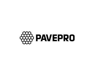
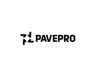
WIP - Concepts for a high end commercial paving and stone architectural design company.
Status:
Nothing set
Viewed:
10134
Share:


Lets Discuss
This one is the best. I love the color and everything, but it might be a nightmare to reproduce. For a black and white version, you should keep the hexigons solid with background color between/around each (instead of the outlined version you have).
ReplyI agree, it really captures the paving/pavement concept. **The contrast of the dark brown tiles and the background needs fixing, but otherwise I think it's very good.
ReplyIs the colouring intential or randomised? I'm trying to find something in the mark. Either way this is real nice. Would look fantastic on a website, I can almost see it now...
ReplyI agree, this one is the best, and the color combo is fabulous.*@itsgareth, I think its random because i've tried to find something there too :P**CHEERS
Replyvery scientific looking mark to me:-)
Replynice one, Bart - too bad about the VE kerning pairs, but that's the fault of the letter shapes, unless you are willing to customize them.
ReplyYeah... you get into that sometimes with certain letter combos. In this case I do not think it is too horrible or distracting.*
ReplyThis is nice and captures the essence of the business, but there is something I want to critique, but I can't quite put my finger on it... hmm... I'll get back to you! :) GOOD work!
Replyvery nice colors!
ReplyI love it. Colors are very good.**This work is simple and very nice. Congratulations!
ReplyI like the logo can you please send me your email so we can work together, my email is ahmed.assal@vertex-techs.com,.
Replylove the colors !
ReplyHeya, are you working with http://threeleaf.tv/ ? If you flick through their showcase in branding they've got this logo in there.
ReplyYes Hindmarsh you are correct. Good friends to work with daily!
ReplyNice work, although I agree in that I think the coloring would be hard to reproduce at small sizes or in grayscale/black %26 white. (My rule of thumb is always twofold: what would it look like in a fax, and what would it look like sewn onto a polo?)**What typeface are you using?
Replyjtroll... it is a modified version of Klavika.
ReplyAh, well done. I wish you the best of luck with this!
ReplyYou did a great job with this Bart.
ReplyPlease login/signup to make a comment, registration is easy