Description:
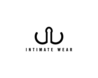
A retailer of adult novelties and women's lingerie. Concept is... well I am sure there are a number of things that can be seen. :)
Status:
Nothing set
Viewed:
4318
Share:


Lets Discuss
hahaha awesome :) Indeed many things can be seen...
ReplyMy my...what big nose you have Mr Wolf %3B%5E)
ReplyQuite possibly the most bizarre (however appropriate) %22iw%22 in the history of logo design. One problem...is it too Semitic. JOKE...it's a joke! I'm joking. Ok. Great job.
ReplyNice hand skills. I'll stop.
ReplyThis one blows me away. Sorry.
ReplyThe design feels just a little naked. Sort of anti-climactic. I think I'm finished.
ReplyIs it possible to have logo envy? I'm spent.
Replytoo many things... mmm good.
ReplySo many interpretations! Including a hanger.*
Replythe comments on this are redickulous!
Replywhen creating logos, anal much?!
ReplyIt's a W, for wear, and an I in the middle
ReplyVery good front end...but what does it make you feel hmmmm?
Replyreally clever! :)
ReplyIm sure the noveltie will wear off,on,off
Replythats really brilliant %3B) and somehow sexy...
ReplyReally hard up for a concept eh?
Reply@gthobbs: You crack me up! :)**
ReplyThis was a hard one.**Took me a bit to come to what it was.**It seems your idea came from some internal place.**Making this logo must have been like making love.
ReplyPlease login/signup to make a comment, registration is easy