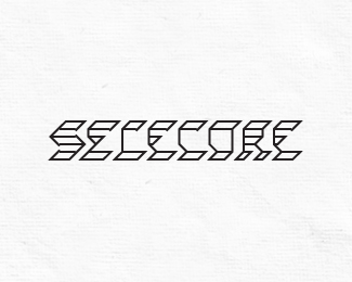
Torch
by balic • Uploaded: Feb. 10 '12

Float
(Floaters:
6 )
Description:
My calligryphic experiment :)
I bend the letters together to make it look more interesting and mystyrious.
Making it was like making a riddle and I hope reading it feels like solving one.
Let me know what you think,
thanks!
Status:
Just for fun
Viewed:
2960
Share:

Lets Discuss
this looks really great luka. the 'c' is a little hard to read, but other than that, great job.
ReplyThank you very much Colin!*Maybe if I connected the upper line of C with R ...?
ReplyAt first i couldnt see the C at all. Guess i riddled it out :D
Replybtw if id try to make it more readable id detach the C from H just adding one more vertical foot to the right of the H so that all can be still connected :)
ReplyTomas thanks for good suggestion. I'm not sure it would make C more readable, and it would break my concept a bit - I wanted every letter to be the part of next end previous letter (eg. left side of R is part of O and right side of R is part of C). So I'll leave letters connected, looks more interesting and tricky to me :)
Replyi see your point luka. good work :)
ReplyAwesome!
ReplyI have the same problem with the C but besides I like it.
ReplyThank you guys for kind words, I appreciate it!
ReplyThe C, as others have mentioned, is hard to read, but it is a really great logo, and concept, otherwise :)
Replyvery very nice ... like ... agree regarding the letter C ... but i'm sure you'll fix it !!
ReplyThank you all! I'll try to fix that C ... when I get some time %3B)
ReplyPlease login/signup to make a comment, registration is easy