Description:
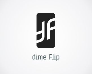
This mark is perfect for any company that has DF initials, for example: Dime Flip, Device First, District Finances, Design Fine, ... or personal initials like Dean Farren.
It can also be easily customized to read "dP" if you need it.
Also letters can switch sides to fit any companies with FD or PD initials.
The mark is clean, strong, friendly, simple, distinctive and memorable.
The rectangle symbolizes stability, pride, confidence and reliability.
The rising angle symbolizes dynamic, speed, growth and success.
The mark is an ambigram, which means that it looks (reads) the same when you look at it upside-down, or rotate it for 180 degrees. It makes logo look very interesting and effective on business cards and other stationery.
As seen on:
Buy here
Status:
Just for fun
Viewed:
5525
Share:


Lets Discuss
cool sign but the text could be better. %3B)
ReplyThanks for comment and thank you swimmers! :)
ReplyHP just lit a cigarette nervously... on the sidelines:)))
Reply:) Looks much different than hp to me. This is ambigram, has different angle, thicknes, style and color and reads dF , not hp. But thanks for sharing opinion :)
ReplyNo, no, it's ok :)*just nervously smoking in aside .... - just joke! Nice ambigram!:)
ReplyI'm not a smoker, I guess that's why I don't get nervous-smoking jokes ...*but I'm used to be unintentionally funny :D
ReplyPlease login/signup to make a comment, registration is easy