Description:
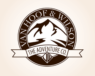
This is a design I made for Van Hoof and Wilson Adventure Company. Let me know what you think!
Status:
Unused proposal
Viewed:
7968
Share:


Lets Discuss
I think you need to work on the banner more. The type doesn't seem to follow the curve tightly, and the ends of the banner look odd because the extend straight out and they're too long. Also, the little monogram you have at the bottom of the circle looks like it says %22UW%22.
ReplyPlease login/signup to make a comment, registration is easy