TD
by alterego • Uploaded: Mar. 11 '11 - Gallerized: Mar. '11

Float
(Floaters:
42 )
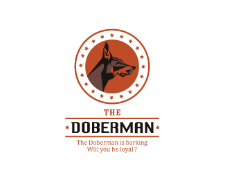
Description:
restaurant lounge concept V 1
Status:
Client work
Viewed:
8101
Share:


Lets Discuss
Larger View**http://oi52.tinypic.com/n1f2ba.jpg
ReplySick stuff bro, sick stuff!
Replydamn!
Replyi think it's on the right path, there are however a number of clashing things. It seems like a final style hasn't been settled upon (hence wip). It looks as though you are trying to create a champagne glass of some sort at the top? Needs a little help, as i didn't see that until after studying it for a good 5 mins. Adding a more defined stem thing and base would definitely help. The line weight around that area enclosing the dog is bothersome, especially at the top where it gets really thick. Are we trying to mimic the dog's distinctive ears here? Not too sure what's going on. The dog: Love the style overall. Top left ear bugs me how it juuuuuust about touches the outer border. I feel like it could be more integrated as a whole into that area, and have an ear or two breaking out of the border. Not totally sold on the crazyeyes, too. The type: Not a fan of this selection. Something like Brothers or maybe even Kabel would work better. **Man it sounds like i tore this thing apart haha I'd take that as a compliment, though, as it means that other people see something in your mark and are excited enough about it to want to offer their advice. I'd much rather hear a bunch of ideas about improvements than hear nothing at all. That would mean your logo just isn't exciting or intriguing enough to start with. **Cheers and good luck.
ReplyWOW !!!
Replyhaha i don't know if that's a good wow or a bad wow. Let me be clear that i love where the logo is going!
ReplyWOW good and Strong mark*Though it needs some sort of tweaking *I feel the nose and mouth part loosing the power
ReplyThe shape around the head brings to mind a violin.
ReplyThe eyes make the dog look a possessed, I would softened them. Also a different type face.Great start! :)
Reply@Outlander**Thanks man... I rectified those issues **@ lumavine **:) that is a bonus !!!**@Tiffani Ink *Thanks for the suggestions...*
ReplyPlz take a look at the difference between old version and the new.**Old: http://oi52.tinypic.com/n1f2ba.jpg **New: http://oi55.tinypic.com/t7fvjm.jpg **
Replyhaha easiest answer here, but i think the nose needs to be somewhere between the old and new one
ReplyOkay Boss... I am a big fan of your Stories :)
ReplyUpdated bottom design element with new one and done slight color change as well.**New : http://oi54.tinypic.com/11ryzah.jpg**Old: http://oi52.tinypic.com/n1f2ba.jpg
Replybetter better
ReplyGreat work man!
ReplyThanks friends ... :)
ReplyGreat piece, congrats on the spot!
Replyhaha what's up with the tag? kinky
Replylooking great..
Replyold school! good!
ReplyThanks Fellas :)**Here is the 2nd concept: **http://logopond.com/gallery/detail/131621
ReplyPlease login/signup to make a comment, registration is easy