Description:
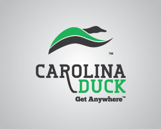
Work done for a duck-hunting boat manufacturer in the SC/NC area. I wanted to show the duck in flight, showing the bright part of its wings (the speculum, which is typically only visible when the ducks are flying) as a recognizable mark, and chose a more refined typeface for the logotype, as most competitors had huge, blocky sans-serif fonts with tons of bevels, italics, and chromed-out gradients.
As seen on:
Carolina Duck
Status:
Client work
Viewed:
1553
Tags:
green
•
sportsman
•
outdoors
•
boats
Share:

Lets Discuss
Love the duck, absolutely love it! It gives a great sense of motion perfect for the company. In my opinion, the elongated leg off the R in Carolina is out of place as everything else fits together, but that's just my opinion. Awesome job!
ReplyThe longer R was inspired by the downward sweeping of a ducks wing when flying. Thanks for the feedback!
ReplyPlease login/signup to make a comment, registration is easy