
Description:
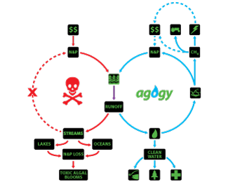
This is a logo I developed for some friends in college who were competing in a clean energy business challenge, who had a technology to prevent chemical fertilizer runoff on farmland through specific harvestable crops. The crops would clean the runoff as it re-entered the local watershed, and said crops could be harvested and digested into fertilizer, and resulting natural gas from the process could generate electricity for the farm and local residents. The name agogy also had a double meaning, representing the meeting of "agriculture and ecology", as well as being a greek word meaning "a person or thing that incites or leads to action".
I wanted to give them a clean look that would fit well on any medium, and thought that the droplet device as the "o", in blue, would give hint clean water, to show the concern for the environment, etc. I included the sidebar with the three lines of text here, to reinforce "clean" as a mnemonic representing their vision. I wasn't sure if it was appropriate or necessary, I keep changing my mind. I think the logo stands well on its own, as well. There's a flow diagram here I made for them too, including the logo.
If anyone's interested in learning what they are trying to do, you can watch their pitch (no, I'm not advertising for them - they don't exist as a company anyway, just providing context) - http://www.youtube.com/watch?v=0OyLnkjomBg
I'm curious to receive some feedback. This is my first venture into developing a brand and a more professional mark rather than a one-off logo for someone.
Status:
Client work
Viewed:
1939
Tags:
water
•
energy
•
clean
•
green
Share:

Lets Discuss
Please login/signup to make a comment, registration is easy